Quantcast
Channel: Maps Matter
Viewing all 117 articles
Browse latest View live

Skeletons in the Water

$
0
0
For a number of years now I have, from time-to-time, made the odd stab at trying to find the flowline of a river from the mapped surface area of the watercourse using OpenStreetMap data.

Windermere Lake District from hill
Windermere in the English Lake District, one of my test cases.
I not infrequently find, being neither trained as a geospatial specialist nor a mathematician, that, although I have a fairly clear idea of what I want to do with some particular manipulation of geodata, I am stymied. More often than not this is simply because I don't know the most widely used term for a particular technique. It was therefore really useful to learn from imagico that the generic term for what I was trying to do is skeletonisation. (I do hope my relative ignorance is not on this scale.)

Armed with this simple additional piece of knowledge immediately opened out the scope of resources available to me from wikipedia articles, blog posts, to software implementions. Unfortunately when I first tried to get the relevant extensions (SFCGAL) installed in PostGIS I was not able to get them to work, so I shelved looking at the problem for a while.

Very recently I re-installed Postgres and Postgis from scratch with the latest versions and the SFCGAL extensions installed fine. So it was time to re-start my experiments.

Once I was aware of skeletonisation as a generic technique I also recognised that it may be applicable to a number of outstanding issues relating to post-processing OpenStreetMap data. Off the top of my head & in no particular order these include:

Wiggly River Trent
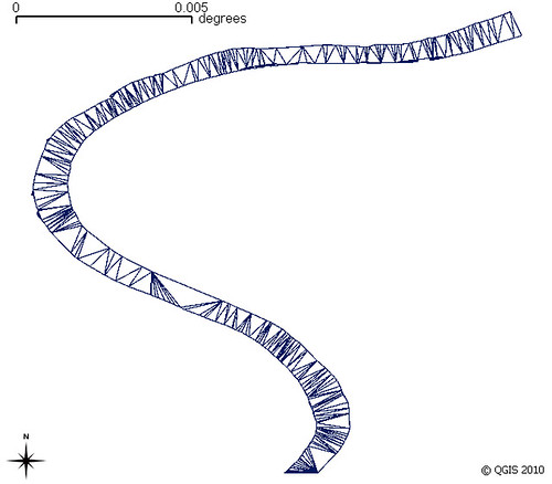
My earliest experiment using Ordnance Survey Open Data for the River Trent
Voronoi triangles based on modes of polygon, clipped back to polygon

  • Waterway flowlines. Replacing rivers mapped as areas by the central flowline where such a flowline has not already been mapped. Such data can then be used for navigation on river systems or for determining river basins (and ultimately watersheds/hydrographic basins). (It is this data which much of the rest of the post is concerned with).

  • Earlier experiments with OpenStreetMap glacier data for the Annapurna region
    Height (contours) & slope(shading) data via Viewfinderpanorams.com
    Voronoi triangulation clipped to glacier used to try & find flowlines for the main Annapurna Glacier.
    Some ideas originated from conversations with Gravitystorm.
    Map data (c) OpenStreetMap contributors 2014.
  • Glaciers. Similarly for rivers although height also needs to be factored in. The idea is not just to identify flows on a glacier, but also simulate likely regions of higher speed flow with a view to creating an apparently more realistic cartographic depiction of the glacier. (Only apparent because in reality one needs lots of good aerial photography to correctly map ice-falls, major bergschrunds, crevasses, crevasse fields etc.).
  • Creating Address Interpolation lines.  A small subset of residential highways have quite complex structures and therefore it is non-trivial to add parallel lines for address interpolation. Buffering the multilinestring of the highway centre lines & then resolving that to a single line would help. (More on this soon).
  • Dual Carriageways. Pretty much the same issue as above except there is the additional problem of pairing up the two carriageways. Resolving them to a single way would make high-level routing and small scale cartography better (i.e., it's a cartographic generalisation technique).

  • The straight skeleton of Old Market Square Nottingham which allows routing across and close to most of the square
    The skeleton does not take account of some barriers on the square,
    but the hole at the left (a fountain shows the principle).
    Data source: (c) OpenStreetMap contributors 2015.

  • Routing across areas for pedestrians. Pedestrian squares, parks car parks etc. Skeletonisation of such areas may offer a quick & dirty approach to this problem.
What follows are some experiments I've done with water areas in Great Britain. I have mainly used the ST_StraightSkeleton function, with rather more limited time spent looking at ST_ApproximateMedialAxis. The two images below show my initial attempt to find hydrographic basins: this works merely by chaining together continuous waterway linestrings. These results are not bad, but several major rivers are divided into multiple watersheds. The map of Ireland shows the problem better because the Shannon system appears as a number of discrete watersheds, largely because the Shannon flows through a number of sizeable lakes. Other major rivers illustrating the issue in the UK are the Dee, Trent and Thames.


River Systems of Great Britain (derived from OSM)
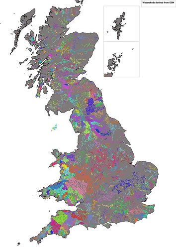
Identification of watersheds in Great Britain by contiguous sections of waterway in OpenStreetMap

Irish Watersheds from OpenStreetMap
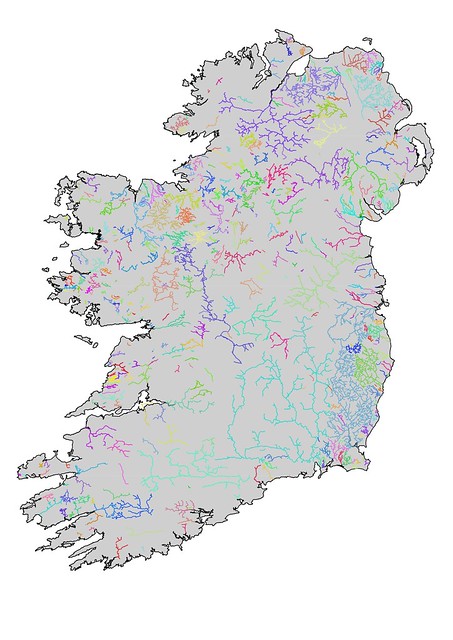
Watersheds in Ireland derived from linear watercourses on OpenStreetMap.
Waterways are generally less well-mapped in Ireland, but also several major waterways pass through large lakes (e.g., the Bann (Lough Neagh), Shannon (Lough Ree, Lough Derg), and the Erne (Upper & Lower Lough Erne)) and no centre line is available.
So the naive approach raised two problems:
  • Lakes, rivers mapped as areas etc also needed to be included in creating the elements of the watershed
  • Actual watersheds can be created by creating Concave shells around their constituent line geometries. Unfortunately I get a PostGIS non-noded intersection error when trying this, so wont discuss it further (although if someone can walk me through how to avoid such problems I'm all ears). As later versions of PostGIS seem more robust I return to this later.
Of course the simple way to address the first one is just to include areas of water as additional objects in the chain of connected objects. However I would also like to replace rivers as areas, and smaller lakes with linestrings as this type of generalisation can greatly assist cartography at smaller scales. The lack of a source of generalised objects derived from OSM has been a criticism of its utility for broader cartographic use, so this is another aspect of this investigation.

So now with skeletonisation routines working in PostGIS time to look at some of the basics.

I've taken Windermere, the largest lake in England, as an example to work through some of the issues. Windermere is a long thin lake which should have a fairly obvious median line. However, it does have some islands which complicate the matter.

Six versions of Windermere showing area, media axis (red), straight skeleton (thinner lines)
for different degrees of simplification (parameters of 0,5,25,125..).
Original shape is shown as a blue outline.`
All created as a single query using st_translate.
Both the straight skeleton & the medial axis are complicated multi-linestrings if I use raw OSM data for Windermere. Progressive simplification of the shape reduces this complexity with reasonable desirable medial axis appearing when simplified with the parameter of around 100 (assumed to be meters in Pseudo-Mercator). Unfortunately there are two problems: the derived axis passes through large islands; and inflow streams are not connected.

I therefore took a different approach. I disassembled Windermere using ST_Dump and cut the line forming the outer ring at each point a stream or river way touched the lake. I then simplified each individual bit of shoreline between two streams & then re-assembled the lake.

When this is done all inflows & outflows are connected to the straight skeleton of the simplified lake area. This can be input directly into my routines for collecting all ways making up a watershed.

Additionally the straight skeleton can be pruned. The simplest one is to just remove all individual linestrings which dangle (i.e., are not connected to a waterway). Presumably one can iterate this until one has the minimum set necessary to a connected set of flows, but I haven't tried this.

Straight Skeletons for Windermere calculated for different simplification parameters.
The grey lines represent a parameter where details of islands are kept but the number of edges in the skeleton is greatly reduced.

Windermere showing inflow & outflow waterways

Detail of the centre of Windermere showing a reduced straight skeleton linked to inflowing streams (blue). The equivalent without reassembly and preserving stream topology is in red
For a single lake it is possible to determine the appropriate degree of simplification to apply, but the complete set of lakes & ponds in Great Britain is a completely different matter.

Over simplification will result in too big a discrepancy between the original shape and adjacent geometries. Even for Windermere trying to include islands in a reassembly fails with too great a degree of simplification because geometries now cross each other.

My approach has been to simplify geometries with parameters from 50 to 250 metres in ST_Simplify. I then compare a number of factors with the original:
  • Do I get a valid geometry
  • Number of interior rings
  • A measure of surface area
With these I then choose one of the simplified geometries for further processing. In general large lakes and riverbank polygons will tolerate more simplification. The overall result is less complicated straight skeletons for further processing. (As an aside I think Peter Mooney of Maynooth did some work on comparing lake geometries using OSM data around 2010 or 2011).

For my immediate practical purposes of finding watersheds I did not perform further pruning of skeletons, but such a process is needed for other applications such as cartographic generalisation.

Even with my first approach which I thought was fairly robust I'm losing a fair number of  waterways with simplification. I haven't looked into this further because it will delay finishing this particular post: and it's been on the stocks long enough.

For further posts on the problems of skeletonisation read Stephen Mathersblog which I found very useful. StyXman is developing a JOSM plugin which uses some of these techniques to create centrelines too. A big thank you to him, and, of course, to Christoph Hormann (imagico).

Using Open Data for Statistical Purposes

$
0
0
A tweet by Owen Boswarva drew my attention to a recent report by Public Health England (PHE) on the correlation of density of fast food outlets and deprivation.

Number of Fast Food outlets normalised to 100,000 population for Local Authorities in England
Source: Food Hygiene Rating Scheme (Takeaway class)
Specifically my interest was directed at the source of fast food outlet counts. PHE used data from PointX, a joint venture of Landmark Information and the Ordnance Survey. I instantlly wondered if one could do the same thing with Food Hygiene Ratings (FHRS) open data. This is a quick report on doing exactly that.

I already had a complete set of FHRS data for September 2016. I needed to download various administrative and census geographies, population figures for Lower Layer Super Output Areas (LSOAs), Index of Multiple Deprivation (IMD) Scores for LSOAs and various files showing the linkages between the geographies.

A certain amount of data wrangling was needed to merge this data (for instance linkages, population and IMD) all came in spreadsheets with awkward column names, multiple sheets and other minor inconveniences. Once these were sorted out I had a table with base figures at LSOA level which could be readily aggregated to Middle Layer Super Output Areas (MSOAs) and local authorities. The IMD score is rebased by summing LSOA scores multiplied by population and then dividing by total population.

Using R I constructed simple scatter plots with a regression line and 95% confidence limits for both MSOA and Local authorities.

Number of Fast Food outlets (normalised) vs calculated
Index of Multiple Deprivation for Middle Super Output Areas

Number of Fast Food outlets (normalised) vs calculated
Index of Multiple Deprivation for Local Authorities
(outlier of City of London excluded)

For comparison the relevant plot from the PHE report is shown below:

Scatter plot from PHE report for Local Authorities

The final comparison I made was perhaps one I should have done at the outset. Comparing raw counts of fast food outlets from the Open Data source (FHRS) and the PointX data. PHE provided a table of counts at ward level. It took me a while to find a shape file and codes which fitted (the codes change year-on-year), but then it was easy to do a Point-in-Polygon count of the FHRS data for a direct comparison. The correlation of values was plotted in R again.

Comparison of number of Fast Food outlets by 2015 ward boundaries
derived from Food Hygiene Data or from Landmark/Ordnance Survey

Doing this took longer than I hoped: but almost entirely because I don't know my way around the various formats of boundary data related to the census and more changeable boundaries such as the wards.

I haven't done a formal comparison of the outputs, but the visuals presented above strongly suggest that FHRS data is just as useful as the PointX data for this purpose. The main explanation for the lower count coming from FHRS is that the PointX data includes outlets which do food delivery which may include places classified as Restaurants in FHRS.

I had expected more issues with FHRS because there is clearly an under-reporting issue in inner city areas due to rapid turnover of management of takeaways (see the recent Guardian article for an in-depth appreciation of this issue). The other week at the London OpenStreetMap pub meeting in Islington I insisted that we should check the 'scores-on-the-doors' before choosing where to eat our Burritos (a habit I've learnt from Dr Sian Thomas). The three fast food outlets next to the pub didn't feature at all on the FHRS data.

In conclusion: now that FHRS data covers nearly every major authority in the country (Rutland were the last still hold out) it is entirely suitable for a range of statistical purposes.

Mapping a specific building form

$
0
0

Arts-and-Craft style semi-detacheed houses, Edwards Lane Estate, Nottingham

My interest in many aspects of urban environments has increased greatly since I started contributing to OpenStreetMap.

I suppose this was always there but largely latent. Wandering around familiar places to capture details to add to OSM often forces me to ask questions about the area. Why is it there? Why is it laid out in that way? Who designed the buildings? When was it built? Why are there gaps in house numbering? What was planned for the little stub street? What used to be on the land with newer houses?

A particular class of urban areas which I find interesting are social housing estates. I've written a little about these before: here and here. Fortunately I am not alone in this interest. Planners, Architects, Social Historians, and others share it. As a result there is more documentation readily available to satisfy casual queries. In the lead is an inspirational blog called Municipal Dreams. Although this has, an understandable, London bias, John Boughton has managed to cover plenty of other cities across the country. Other blogs may cover individual estates in detail, for instance Ian Waites'blog on the Middlefield Estate in Gainsborough, . For Nottingham, I'm lucky that Chris Matthews has written (an all too short) history of council housing in the city.

This particular blog post originated when Municipal Dreams tweeted a picture of a characteristic Arts-and-Craft style house in Osmaston, Derby:


This house looked very familiar: there are hundreds of similar houses scattered across Nottingham on estates built by the city council between the 1920s and the 1940s. It prompted me to systematically add all such houses to OSM. So far, I may have missed a few, I have found over 900 across the city as shown in the map below.

Distribution of this particular building style across the city of Nottingham.

Just adding the footprints of the houses is not enough. Additional tags are needed to be able to identify this particular design. At present I am using personal tags as an interim measure. I hope that ultimately it will be possible to accurately identify the design reference used by the Nottingham City Housing department (see examples in Alex Ball's post on their early work). I am documenting my approach on the wiki.

Sherwood Perry Road 2235
One of the earliest examples of the design. Perry Road, Sherwood Estate.
Later examples (see below and above) either have hanging tiles covering  first floor at the front, or are not rendered at all.


Houses on Charnock Avenue, Wollaton Park Estate
Only 4 pairs of houses of this type were built on this estate.

Side view of Charnock Avenue Houses.
Using Environment Agency Lidar open data and Simple 3D Building tags I've had a go at capturing the form of a couple of these houses too: the image below shows how they are rendered on F4 Map.
Screengrab from F4 map.
The S3DB rules for the two houses are slightly different.


Given that the houses were built over a period of about 20 years it can be awkward to date them. In addition to old maps and various information in the Matthews book and on-line, there are archival aerial photographs of the estates largely taken shortly after they were built.

Bulwell Hall Estate photographed from the South-west 1930.
The semi-detached houses discussed in this post can be seen at the far end of the road in the foreground.
Source: Britain from Above.
Aspley Estate from the S in 1931.
Again the houses are most prominent in the corners of street intersections.
Source: Britain from Above.
Sherwood Estates from the SW in 1928.
The rendered houses shown above are in front of the school centre left.
Source: Britain from Above.
These pictures also give a good impression of the sheer scale of Nottingham's social housing programme between the wars. These three estates were more or less complete by 1930 and several others followed before the start of WWII. For instance the Broxtowe Estate consists of around 1700 houses. It's difficult to determine the exact year of construction, but surprisingly easy to identify the decade, so for some I have tagged them with decade_built=*.

Mapping this level of detail: a single design for a single type of house is feasible within a city and when they are all built by a single organisation. It may also be suitable for many of the private housing developments built post-war by national firms (Wimpey, Taylor Woodrow, etc) as they often used identical designs. It becomes more problematic when very similar, but not identical houses turn up across the country. Being alerted to this by Municipal Dreams, I noted a pair at the junction of Park Drive and Nottingham Road in Ilkeston, and then I came across these houses in Station Road Awsworth:

Station Road, Awsworth. Note minor differences (absence of bay window, single window at side etc)
Although we can identify these houses with a range of tags:
  • building=semi-detached,
  • building:architecture=arts_and_crafts,
  • decade_built=1920,
  • architect=* (if known),
  • developer=* (or building:developer);
it is still very difficult to envisage a single typology which is likely to satisfy the demands of mappers, historians of social housing, architecture and planning. However, I hope I have shown here that much is possible with OSM data at a local level.

Linear or 1D maps from OpenStreetMap

$
0
0
1-D map of Clumber Street
Clumber Street, a pedestrian shopping street in Nottingham

We are all familiar with 1D, or linear, maps.

We see them in graphics at bus stops; use them to work out when it's our stop on the metro; there's even a whole genre of using the style of the London Underground map for other purposes. Here are one or two examples:

KK A New Service Brochure Map
New York Subway line map from 1960s


Extrait Tablede Peutinger Secteur Rhône et Alpes
An excerpt from the Tabula Peutingeriana
Réseau Grand R, poteau d'arrêt
Bus stop showing typical public transport use of 1D maps
Jefferys's itinerary; or travellers companion Fleuron T221156-3
A 18th century road itinerary for Northumberland
Jeffrey's Fleuron (perhaps also a strip map)

If you want to know more, Laurence Penney, from Bristol, gave a highly condensed version of his talk on these maps at the international State-of-the-Map conference at Birmingham back in 2013. He has a fantastic, and ever growing, collection of examples going back at least as far as the Tabula Peutingeriana a Roman scroll of road itineraries (as a 19th century facsimile. 
 
Like cartograms, 1D maps were always a map style which I have wanted to create using OpenStreetMap data. Over the last few years I have made sporadic efforts to see how I might create them, and for quite some while I have had a reasonable notion for a workable approach. However, doing so required a fairly concerted effort to break through the little annoyances which occur at every step. In the past couple of days I have made just that effort, and seem to have something which is reasonable, and certainly meets my initial goals.

Why Now?

The reason why I knuckled down to the task was pragmatic.

For several years we have spent an hour before our summer pub meetings in the East Midlands (Nottingham and Derby) mapping areas close to our meeting place. These partly help to improve OSM, but were also conceived as a way to show interested parties what was involved in mapping. This year I felt that it would be worthwhile to focus our energies in this hour on checking the centres of Derby & Nottingham for change.

As OpenStreetMap data becomes richer the issue of maintaining existing data becomes more pressing. Amenities, shops and other points of interest in town and city centres are particularly prone to change and are often changes are often difficult to spot in any systematic way. It seems axiomatic that we should strive for a means which makes checking existing data somewhat less arduous than the effort it took to create in the first place, but often that is not true. Some editors, do help a bit: Vespucci, for instance, highlights objects which have not been touched by an edit within the last year.

Clearly something which reduces the quantity of information to validate ought to help: hence 1D maps.

Outline of the technique.

As I stated above, I've had a reasonable idea of how to approach the problem for a while. These are the key steps I envisaged :
  • Merge all ways belonging to a particular road (identified by a common name and/or ref).
  • Create a single centre line for the road (to eliminate spurs, dual carriageways, roundabouts, service roads etc).
  • Identify all POIs belonging to a given street: this might be because they have the appropriate street name or are within a given distance of the street centre line (corner buildings, for instance may belong to another street, but be equally prominent on the intersecting one). 
  • Locate the POI along the centre line, and, importantly, which side of the line it is located.
  • Calculate distances along the centre line.
If this all goes according to plan one ends up with a tabulation like this:

Name POI Type Distance Along (m) Side of Road Distance Offset (m)
Curry 77restaurant173R21
The Salutationpub192R24
Cuminrestaurant218L18
Nottingham Credit Unionbank227R29

This format gives enough data to work on a suitable rendering.

In practice the second point is what took most time, so in the rest of the post I'll describe the steps in detail. I make no claims for elegance, and some of the steps I certainly didn't use the perhaps the best tools. Be warned there is a lot of nitty-gritty stuff below!

Step by Step guide

The Road Network & POIs

I used two Overpass-Turbo queries to download all highway ways and a discrete set of POIs (all amenities, shops and offices) from the same bounding box. Data was downloaded as Geojson and immediately uploaded into PostGIS (using the QGIS DBManager). I converted everything to the British Grid on upload which simplifies distance calculations, but also gives some 'safe' areas to locate transformed data at the end.

Next I grouped all highways with the same name into multilinestrings:
SELECT nextval('street_seq') street_id
     , name
     , st_multi(st_union(geom))  geom
  FROM hwy_upload
 GROUP BY name
The additional st_multi is needed because most roads will still be a single linestring when merged with the union function. Operations also need to work with more complex roads, so they are all treated in the same way.

Generating a Centre Line 1 : creating an approximate medial axis

The first operation in generating a central line is to buffer the entire multilinestring by some arbitrary value (20 metres worked for me), and then use st_approximatemedialaxis (discussed extensively in an earlier post) to create a first cut medial axis.

There are several problems with the medial axis generated by the PostGIS functions:
  • In many cases it cant be resolved to a line. 
  • It's a multilinestring (I think even if the linear segments can be merged into a linestring).
  • It appears that it is constructed of many 2-point lines.
  • Some of the piecewise linear segments are minute (nanometres in length IIRC)
  • There can be many short or very short stubs.
These problems were what stymied me when I first looked into using the medial axis.

Some can be reduced by using st_snaptogrid. Using a 1 m snapping grid is absolutely fine for my purposes and eliminates some of the more absurdly short segments. After considering various ways of pruning the medial axis graph I instead decided that routing through it was easier to try.

Generating a Centre Line 2: using pgrouting 

As I had the data in PostGIS pgrouting was a fairly obvious candidate to generate routes. It is a relatively lightweight set of tools for generating routes and trivial to install

To prepare the data for pgrouting I decomposed the medial axis multtistrings using st_dump and stored them in a new table.

I also extracted all the points (node) from the original road linestrings and for each street found the pair of points which were most distant from each other. These two points would be used later as the source and target nodes for routing:
WITH st_pt_distance AS (
      SELECT street_id,
             a.pt_id source_pt_id, b.pt_id target_pt_id,
             a.pt_geom source_pt_geom, b.geom target_pt_geom,
             st_distance(a.pt_geom, b.pt_geom) distance
        FROM hwy_pts a, hwy_pts b
        WHERE a.street_id  = b.street_id
          AND a.pt_id <b.pt_id
           )
SELECT street_id,
FROM st_pt_distance
WHERE distance = (SELECT street_id, max(distance)
                    FROM st_pt_distance
                GROUP BY street_id)
As I only want routing along an individual street it was not obvious if I could safely use a single table for pgrouting. I therefore decided to use a temporary table for each street, and iterate over each street using a Postgres stored procedure. Streets with inconvenient geometries (such as those having two exterior rings when buffered) are eliminated at this step.

Examples of buffered roads with rejected geometries (mostly in 2 or more parts).
Some are correct others needed fixing
The basic means of generating a route was as follows:
  • Create the temporary routing table:
    CREATE temp_table AS
    SELECT a.street_id, (st_dump(aml_geom)).path street_seg_id,
           (st_dump(aml_geom)).geom as geom,
           st_length(st_dump(aml_geom)).geom) as cost,
          
    st_length(st_dump(aml_geom)).geom) as reverse_cost
      FROM hwy_upload
     WHERE a.street_id = <value>
  • Prepare the table for pgrouting:
    SELECT pgr_createtopology('temp_table', 0.0000001,'geom');

    This routine creates another table temp_table_vertices which contains the nodes (vertices) of the routing network). Useful to remember when cleaning up the temporary tables. (I'm not sure why I used such a small value for the second parameter. I think I was worried about the very short segments which I later eliminated).
  • Create a route. I used the standard pgr_dijkstra call which returns a list of all vertices and edges making up the route:

    SELECT *
    FROM pgr_dijkstra('select street_seg_id,
                       source,
                       target,
                       cost,
                       reverse_cost from temp_table',
                      (SELECT id FROM temp_table_vertices_pgr
                        WHERE geom = (SELECT start_pt from hwy_upload
                                       WHERE street_id =<value>)),
                      (SELECT id FROM t
    emp_table_vertices_pgr
                        WHERE geom = (SELECT end_pt FROM
    hwy_upload
                                       WHERE
    street_id =<value>))
  • In principle I should have been able to just use st_linemerge to assemble the parts of the route, but I found some small gaps which prevented the function from working. Instead I used the ordered set of nodes and made the line from them with st_makeline. This approach rather relies on the medial axis segments only having 2 points. (This may have been related to the short segments, but I haven't tried the original technique since then):

    SELECT st_makeline(pts) geom from (
        SELECT c.*
        FROM
            ((SELECT b.street_seg_id,seq,node,edge,agg_cost, geom,
                     st_pointn(b.geom,1) pts 
                FROM pgr_dijkstra(<see above>) a
                JOIN hwy_aml_dump b on edge=
    street_seg_id)
                ...
And VOILA! we have a centre line, almost home and dry.

Adding the POIs

It is now trivial to calculate position along the centre line for each of the selected POIs using st_linelocatepoint:

SELECT street_id, poi_id,
       st_linelocatepoint(
         st_pointn(
           st_shortestline(poi.geom,street.centreline_geom),
         2),
         centreline_geom)
       * st_length(centreline_geom) distance_along_street
  FROM streets street, pois poi
 WHERE street.street_id = poi.street_id
The offset from the centre line is given by st_shortestline, but we need one other piece of information: where the POI is to the left or right of the centre line. Unfortunately it is not possible to rely on the shortest line dropped to the street centre line. It needs to be extended slightly to ensure it crosses the street centre line. Doing this is fairly painful in PostGIS (best managed with a simple function, see GIS Stack Exchange for examples):
SELECT st_makeline( /* line from POI to 5 m across centre line) */
         geom,      /* POI location */
         st_translate(geom, /* xsect_geom is intersection point */
           sin(st_azimuth(geom, xsect_geom ) *
           (st_length(st_shortestline(geom,
xsect_geom ))+5),

           cos(st_azimuth(geom,
xsect_geom ) *          
           (st_length(st_shortestline(geom,
xsect_geom ))+5))
  FROM pois
Now the st_linecrossingdirection function works every time, and because these are simple straight lines we can assign POIs to left or right.

Pulling it together

Maid Marian Way in central Nottingham
showing the calculated central line (orange)
and short lines (red) from POIs.
This is a topologically complex road.
Now all the components exist and it's possible to generate the tabulation of POIs shown above. This is in itself quite useful, we used my initial tabulation a little last night until the rain made paper-based mapping infeasible. However, the original goal is some kind of more usable visualisation such as that shown at the head of the post. I'll discuss how I used QGIS to achieve this in the next post.

I will add queries & other code to github in the near future, probably as GISTs for now. Much of this was driven by wanting something to hand for our first mapping evening, and in many cases I went with what I could get to work quickly rather than investigating why a given result was unexpected.

One other unexpected benefit is that I discovered a few bugs in OSM data. As is often the case when one looks at a larger set of data inconsistencies and minor errors stand out rather quickly.


Can we identify 'completeness' of OpenStreetMap features from the data?

$
0
0
At the Milan SotM conference Stefan Keller from the Geometalab at HSR (Rapperswil) will talk about recent work of his group on identifying "Areas of Interest" (AoI) from OpenStreetMap data. Stefan has been kind enough to involve me in some discussions about this work as it has progressed, but in this post I am solely concerned with a separate issue arising from the use of points of interest in this work.

Growth of shops mapped on OSM for selected Local Authorities
(See Analysis section below for commentary)


Areas of Interest were introduced on Google Maps back in 2016. Loosely they correspond to shopping, entertainment and cultural areas with large clusters of relevant points of interest. No doubt Google not only used map features, but also other sources of data such as location of Android phones to calculate the footprints for Areas of Interest (shown in a pale orange or salmon colour on Google Maps).

There are issues with the Google implementation, some discussed in this CityLab article from 2016. My own examination of Google Maps confirms that shopping areas which are otherwise equivalent in range and type of shops are chosen as AoI in wealthy areas, but not in poorer areas dominated by social housing. I also found some places, notably the UBS IT centre in Altstetten, Zurich, which have erroneously been identified as AoI by Google. The work of Geometalab is therefore interesting not just in terms of whether OSM data can be used to calculate similar areas, but also to provide suitable data where biases based on socioeconomic status can, at least, be identified and corrected because data and code are open.

Zurich, centre and Aussersihl districts, showing Areas of Interest.
Work of Geometalab, derived from OpenStreetMap data.
The starting point for this type of work relies on areas where POI mapping density is high and reasonably complete (for instance, the areas of Switzerland which Stefan's group have looked at, and areas of the English East Midlands and Germany which I have looked at both recently, and in the past). Given that it is possible to calculate reasonable AoIs from OSM data where PoI density is high, the question arises "Can we identify which areas are 'reasonably' complete?". Normally, this type of work has involved comparing OSM data to some external reference data which are assumed for the purposes of comparison to be complete (for instance Peter Reed's work on UK retail). However, in many parts of the world, and for many topic domains there is no readily usable data for this purpose. So the ancillary clause for the question is ", and we do this with OSM data alone?"

This post is a first look at the problem for one class of POIs:  shops.


Species Accumulation Curves

My starting point comes from familiarity with something called a Species Accumulation Curve. I believe that there are strong points of commonality between how OSM data is accrued and these curves.

For many groups of plants, animals, and other biota, it is nigh on impossible to find, in a single survey, all the different species which grow or live in a particular area. Numerous factors influence this:
  • Surveyors' skills. Not every surveyor has the same skill set, training, or even just visual acuity. One of the best naturalists I know is a care worker, who can trump national and international scientific authorities by finding more species than they can in the field.
  • Seasonality. Plants flower at different times, birds migrate, some insects are on the wing for a short time.
  • Weather. The hot dry weather in Britain has greatly reduced the number of flowers I have seen in the past few weeks, and consequently their insect visitors. On Sunday I was heartened to lead a field meeting where we found 44 species in our target group; but 10 years ago in the same location & at the same time of year we found nigh on 30 more.
  • Predator Prey relationships. Many species numbers go in cycles (for instance Lemming years), but at least for some insects population density has been estimated to be an order of 10^12 between the troughs and the peaks. Ideally one surveys through 2-3 full cycles: problematic if they are 17-year cicadas, or bamboos which flower and die on a 70-year cycle.
  • Increasing knowledge. Sharing of techniques for searching or recognising different plants and animals can have an amazing influence on total numbers of species found. This is true even in Britain for as well studied a group as the higher plants. The BSBI's Atlas 2020 project which will be completed in 3 years time, will not only show changes in plant distribution brought about by agricultural intensification, increased urbanisation and climate change, but also changes from looking more closely for a wider range of plants (notably urban weeds and garden escapes).
  • Sheer cussedness. Fungi are particularly awkward customers. Most spend their time invisibly underground, only showing fleetingly as fruiting bodies (mushrooms) when they feel the time and weather is right. Even with the most capable surveyors in the world the full extent of species complexity can only be appreciated by continual regular surveying of the same place. There are two locations in England which demonstrate this point. Esher Commons have been regularly surveyed for fungi by scientists, including global authorities on some fungal groups,  from Kew Gardens for many years. No other place in the world is know to have as many fungi, and around 20% of all fungi known in the British Isles have been found at Esher. Slapton Ley in Devon has also received decades of regular surveying effort for fungi, and has over 2000 known fungi species. It may be come second to Esher for known fungal diversity!
  • Recorder effects. Even for professional scientists it is often difficult to maintain a constant recording effort. Most biological data is gathered by citizen scientists who can only devote what leisure time they can spare for the activity. Recorders tend to be located in larger cities, rather than in potentially highly species diverse remote areas. For many species groups only a few people are seriously dedicated (as in my own interest in Plant Galls).
The key advantage of species accumulation curves is that, whilst not impervious to these effects, they are a relatively robust measure. For my fungi-loving friends they are a useful tool to work out when to move on from one area to another. At the scientific level the curves are well studied and there is a good framework of statistical techniques for analysing them.

Differences between OpenStreetMap & Biological Record Data


Data collection for biological recording differs from that for OSM in one particularly important aspect. For biological records all observations in each survey count. In OSM every repeat observation of the same POI (pub, shop, restaurant) is never collected. This means we can make no use of properties of each individual survey activity which contributed POIs. Also there is absolutely no equivalent of an OSM import for biological records. I've focused on Great Britain, so the latter has little impact on the results I present below.

We can still look at two types of accumulation:
  • of individual shops;
  • of shop tags.
Note that empty shops are meaningful data in the first grouping.

Null Hypothesis

Typical small shops which get mapped piecemeal on OSM:
near Conde de Casal Metro station
Av. Mediterraneo, Madrid, Nov. 2016


My null hypothesis is that over time we should see the number of shops on OSM for a given area tailing off towards an asymptote once the area is well-mapped. I know that surveys I did in the Spring of 2013 changed the percentage of shops mapped in Nottingham from around 40% towards 90%. Even earlier Jean-Louis Zimmerman and Tony Emery had mapped Orange in great detail and a map of the town was published. I therefore took these two towns and a few others to see if this was plausible. Data were gathered point by point using Overpass-turbo, and plotted in LibreOffice.


The two towns (Nottingham & Orange) where I had good reason to believe that shops were reasonably complete some years ago formed a baseline and did appear to show curves with asymptotic properties.

The remaining places I chose on the basis that I knew that they are well-mapped, but without knowing if retail properties had been mapped to completion. I thought that it was plausible that this would prove to be true for Zurich & Karlsruhe, certainly not for Madrid, and likely not for Dakar. San Francisco was chosen as a well-mapped location in North America. In practice none of the graphs for number of shops over times suggests that effort to map shops has reached an inflexion. Even for somewhere like Karlsruhe which has had active mappers for as long as anywhere the graph suggests that there is still scope for mapping shops.

Gathering data point-by-point is fine for a quick test, but far too tedious (& expensive in use of free resources), so my next step was to wrestle with OSM History files.

Extracting OSM History data

I already had an OSM History file for Great Britain for June 2017 downloaded from Geofabrik. Unfortunately, these files do not appear to have been updated since Geofabrik changed the user metadata available on their public servers. Also because history files contain user information protected by GDPR, these files are now only available through using an OSM sign-on now.

Manipulating history files effectively means either using the command line osmium tool or writing programs using osmium library. This in turns means installing osmium. I therefore did this under Ubuntu 16.04. There is a packaged version of osmium for Ubuntu, but it is ancient, so it is necessary to compile and install the current version 1.8.

Osmium is very much designed for heavy duty sophisticated processing of OSM data. It's not really a toolset for quick-and-dirty ad hoc investigations of the kind I do. I was apprehensive about getting tied up in knots getting the Osmium tool installed, particularly when I read the list of dependencies.

In practice the only problem I had initially was due to not cloning a couple of packages into the right location in my osmium build directories. As I've never used Cmake in my life I was certainly intimidated by the simple statement "Please read the CMake documentation and get familiar with the cmake and ccmake tools which have many more options.". However, reassured by Richard Fairhurst & Andy Townsend that it wasn't too difficult to install I preserved and soon had it installed. One thing I would have found helpful would have been an outline of the directory tree for a build.

I also had a 5 minute attempt to compile Peter Mazdermind's OSM History tool, but this has not been maintained and uses very ancient versions of osmium, so I did not preserver.

The key reason for using the 1.8 version is that it has better support for extracting dependent data. Thus in a two step process it is possible to filter a history file for all elements tagged with shop and then find all their dependent elements. This is well covered in the osmium manual.

For pragmatic reasons I chose the One Per Line (OPL) format, as I could very quickly load this data "as is" into a Postgres database.

Wrangling the Data

As I have done for years I loaded the data exactly as it was stored in the source file, so that I could start from the raw data at any time all within Postgres. In practice I loaded nodes, ways & relations with  distinct COPY TO statements.

I then processed each element type into base tables: transforming the main columns from strings to the proper datatype. Tags involves converting the string into an array separated by commas in the form key, value, key1, value1 .... This in turn converts simply to hstore.

For each element the next thing was to calculate the end date for each version and add this to the . This can be done with a window function, or by joining the base table to itself (a left join). (See my very old post for one way to do this).

The major disadvantage of my pragmatic approach is that one has to reassemble geometries, but before one can do that it is necessary to determine the potential number of distinct geometries for each version of a way or relation element. As others have done before me I ignored relations (very few shops are mapped as relations), and just worked with ways. To do this I first found all distinct start dates for all the nodes versions which contributed to any given way element, which can then be treated as minor versions of each way version. I actually prefer the term geometry version. You can see something very similar if you look at the history of a way in Potlatch2.

Once I had the start and end dates for each geometry version the linestrings for the way can be assembled by joining the way_node_history, way_geom_history and node_history tables. All ways should produce valid linestrings. By storing the linestrings it is possible to preform multiple checks so that the code only attempts to assemble valid polygons (st_npoints(geom) > 3 and st_isclosed(geom)) worked for me.

The shop data is relatively small, under 70k ways, totalling around 125k versions, which expands to 180k geometry versions. For nodes of course versions is the total : 100k elements, 200k versions. Given the data goes back to 2007, the increase in data volume to handle history is very modest.

The last thing I did was calculate a centroid for all the data (this can include ways which do not form polygons). All analysis used the shop centroids.

It's worth noting that another paper in the SotM academic track by Alexander Zipf's group at Heidelberg may presage much easier analysis by anyone of OSM historical data without the need for this kind of data manipulation.

Analysis

Shops by Local Authority

My starting point was to look at how many shops have been mapped within each local authority across Great Britain. This enables looking at a much more representative sample than the few cities I looked at earlier. There is a disadvantage in that local authorities do not correspond to cities and therefore may not make natural mapping units.

A first couple of quick plots show that there is a huge diversity in numbers of shops mapped, when they are mapped, intensity of mapping activity, and so on. When all are plotted together it's difficult to pick out any other trends:

Progress in shop mapping for all Local Authorities in Britain
(the top lines with over 2000 shops are : Birmingham, Bristol, Edinburgh, Leeds, Nottingham and London Borough of Westminster)

Percentage of shops mapped at June 2017 in prior months,
all Local Authorities Great Britain.
If we just look at the raw number of shops mapped, the accretion curve is more or less flat, with no sign of tapering off:


Just looking at the top local authorities can highlight a few other features:
Local Authorities with more than 2000 shops mapped mid-2017

Most of these places have seen a fairly steady increase in total shops mapped, but there are a few step changes:
  • Birmingham, 2015: Mattijs Melissen (Math1985) was a very active shop mapper at this time. The tailing off subsequently may merely because he returned to The Netherlands on completing his post doc.
  • Edinburgh, 2014. The Edinburgh MESH (social history) project were actively mapping the inner city during this period.
  • Nottingham, 2013. My own deliberate attempt to map most shops from around March to June 2013.
Clearly spurts of activity such as these are fairly typical of many areas. The extreme is Darlington where virtually all shops on OSM were mapped over at most a couple of months. Pulses of activity may therefore result in curves which are apparently asymptotic, but these only reflect individual mapper activity. I have not included counts of mappers touching elements tagged with shop, but this suggests some such metric may need to be used to avoid false positives from dedicated mapping of shops by single individuals.

A much easier way to look at the data is by looking at graphs side by side. I selected all LAs with over 800 shops mapped, which gives a convenient set of 45 different ones. The graphs are at the head of the blog. Out of these 45, only 2 suggest there might be an asymptotic relationship in the data: Nottingham and Tendring. There are plenty more examples of many shops mapped over short periods (e.g., Gateshead, Sefton).

Shops by Tag

We can also look at whether there is any indication that we have mapped a given category of shop to exhaustion. Here are accumulation curves for the top 35 tag values (those with over 1000 elements mapped:

Only shop=supermarket and shop=doityourself have any appearance of slowing down, and it would be a long stretch to say they were trending towards a given number.

In pretty much all cases the accumulation curves are linear. Thus individual shop tags are much less vulnerable to individual mapper activity. The one step function is shop=bookmaker where Math1985 initiated an effort to reduce the number of synonyms. Slightly worrying is the steady increase in shop=yes.

Lastly we can look at the total number of shop tags:

This looks more like the kind of graph I had been hoping to see. The drop around early 2015 was again, no doubt, due to Matt85's rationalisation efforts. It perhaps suggests no more than 2000 tags are needed to map shops in the UK.

In previous work I showed that there is a long tail of very low usage shop tags, and that the presence of these tags is usually in the noise (I was able to assign 98-99% of all shop tags to specific general categories). It struck me that removing this noise may provide a more informative graph. I therefore excluded any shop tag which had been used 5 times or less in June 2017:

Finally, I have the kind of graph I predicted. It actually looks as though 500 shop tags pretty much meets all our tagging needs.

Even without trying to fit curves to the rest of the data, it is clear that even in well-mapped cities, the data from 2017 suggest that there are plenty of shops to map. It may be with more tightly constrained boundaries we may see more curves suggestive of saturation. I'll look at this in the next post.

Coda on shop completion rates on OSM

$
0
0
Thanks to John Baker (Rovastar) for a few suggestions discussing my recent blog post in the pub last night:

  • What do the graphs of numbers of unique shop tags look like with heavier filtering of relatively poorly used tags.
  • E-cigarette shops are a recent phenomenon, and should represent a genuinely novel tag rather than the mix of typos, synonyms etc which characterise much of the long tail of shop tags.

These were easy to follow up, so I present the graphs here:

Unique shop tags over time on OpenStreetMap for Great Britain,
filtered to remove tags with a restricted number of uses as at June 2017.
For virtually any level of filtering the curves level out around 2010-2011. Thus the core set of shop tags looks to be very stable. A good place to judge the extent of likely synonymy for shops in Britain is the LUA script used by SomeoneElse for his "Useful Maps".

Growth of mapped e-cigarette shops in GB on OSM
As expected e-cigarette shops first appeared rather late, at the end of 2013, and there are a decent number mapped (over 200 by mid 2017). I haven't checked, but I suspect the sharp increase in 2017 was caused by some tagging rationalisation. It's not unusal for new things to acquire a range of synonyms before tagging stabilises and one value becomes favoured. (It's equally true that in some cases this does not happen).

I've had a couple of other requests which it will take rather longer to look at, but if you have ideas relating to shops in Great Britain I can look at the data right now.

Post Boxes, or why

$
0
0
Japanese OSM contributor has done a fascinating piece of work. They have tried to build a class of model all the rules for access restricitons on highways, nad particularly relate them to the Japanese highway rules.


There are a few simple lessons:

  • Often the real-world situation we try and capture on OpenStreetMap is inherently complex.
  • Depiction of the rules in a more formal model, such as a class diagram, helps in codifing that complexity. In turn it also introduces additional complexities in the form of abstruse terminology, and the requirement of very specific skills and knowledge for the information to be useful.
  • Codifying everything held in OSM is a huge task. This is one tiny corner (access restrictions) of one area (highways)  in one country (Japan), that gets added to OSM.
These factors should be salutary for those advocating more formal models for OSM tags. For some time I have been reflecting on how something as simple as an ordinary post box can show the same sort of phenomena.


The first post box to be added on OSM was at .

Post Boxes vs Letter Boxes

The Anatomy of a Post Box

The Physical Post Box


Colour

We're all familiar with post boxes of the standard colour for where we live: pillar box red in he UK, green in Ireland, yellow in Spain, and so on. So normally the colour is associated with the main operator of full-service postal services in a particular country.

Gold Post Boxes

A spectacular fly in the ointment with modelling unusually coloured post boxes are those painted gold by the Royal Mail to celebrate British gold medallists in the 2012 Summer Olympics and Paralympics. Each post box commemorates a gold medal winning performances by a specific athlete, or team. However, some athlete's achievements have been marked in more than one location.

Collection Times


Interviewed by OpenCageData

$
0
0
I was recently interviewed by Ed Freyfogle of OpenCageData.

Ed asked some questions about this blog which I had to think about a bit. I'm not sure if I've explained myself very well, but, in case you missed it, the interview is here.

At some stage when I've cogitated on these answers even more I might expand them directly on the blog.

Where the streets have no name: Coach Road Estate, Washington

$
0
0
Serlby Close, Usworth. The houses on the left are part of Coach Road Estate
Source: © Alex McGregor at GeographCC-BY-SA-2.0
Microsoft, like a number of other large tech firms, now has teams working to improve OpenStreetMap. A couple of weeks ago they turned their attention to the UK, and asked about some roads apparently missing street names.

I checked a few of these examples using available Open Data sources, primarily those of the Ordnance Survey. For the most part, our existing mapping seems correct: there is no official street name. Many were places like caravan parks and industrial estates, but one really stood out. This was an area on the north side of Washington, County Durham called Coach Road Estate. As I investigated it soon became apparent that the estate is interesting for other reasons too.


It's very unusual for roads in an urban setting to lack names.  Although it is not uncommon in the countryside where addresses will be of the form <housename>,<village-name>. However it was very easy to verify that this was indeed the case for the Coach Road Estate. The main reason being the existence of an abundance of government open data about the site (nearly 700 records in all):
  • Food Hygiene: a single convenience store is present.
  • Naptan: bus stops on the estate all use the name, and conveniently often include the nearest house number.
  • National Register of Social Housing. Although this stopped being maintained in 2011 it is still invaluable not just for addresses, but also to identify planned estates of social housing (council estates, colliery villages etc).  There are hundreds of addresses ranging from 1 to 589 in this dataset (there are 648 records in total, but this includes a lot of garages). As they have postcodes they can also be geolocated.
  • Companies House: five companies are registered at four addresses on the estate.
As can be seen by the geography of the data which can be reasonably accurately located (i.e. postcode centroids), the bounds of the area are self-evident even before viewing aerial images.


Screenshot from Will Philips OSM-Nottingham website
showing geolocated OpenData with "Coach Road Estate" in the address, name or other field.
Unfortunately, I failed to screenshot this before mapping the area in detail.
(Although the site is focused on the Nottingham area it now allows searches on most UK open data useful to OSM).
Having established from multiple sources that the name belonged to the estate as a whole and not to it's roads, it was time to add it to OpenStreetMap. Although the estate has perhaps 600 houses it's too small to be a suburb, so I decided to add it as place=neighbourhood. Unusually, because it has such precisely delineated boundaries, I could map the area itself.

It was also possible to add a few addresses from Naptan.  This is a classic case where the addr:place tag can be used in addresses. Fortunately there were two bus stops close together on the NE corner of the estate which allowed, with some judicious guesswork, many more addresses to be inferred.

By now I had multiple other questions: When was the estate built? What types of houses? Was it planned as part of the New Town, or earlier? Was it constructed to provide housing for colliery workers? Can we find out anything about the layout?

Fortunately the first question was easy to resolve: the estate is not shown on maps from the 1940s and early 1950s, but is partially complete on those dated around 1960. This in turn suggests that it pre-dates the New Town, which was formally designated in 1964.

Washington, unlike other new towns, was not built on a predominantly green-field site. Rather it was already an area of piecemeal scattered housing and associated industrial areas (mainly collieries).

Dispersed settlement patterns of this type were quite common on British coalfields (the area where my father comes from Hollinwood, Oldham is an example from elsewhere, although the pattern has been obscured by later development). The development sits in the former parish of Usworth, which at the start of the 20th century contained a nucleated village, Great Usworth, a development of long terraces of workers housing extending piecemeal westward from Usworth Colliery, and scattered terraces elsewhere. These terraces would have provided very small basic houses, mainly for colliers. My great-grandfather, born around 1860, lived in such a house in Hollinwood. It was not a "Parlour House", but the main living area was entered directly from the street, behind this was a scullery with a slop stone (a large sink), and perhaps 2 bedrooms upstairs. The toilet was in the back yard. My father remembers that the front door of my great-grandfather's house was rarely closed, and a large coal fire was kept burning on even the warmest days (as a miner his coal allowance was more than they needed). Amazingly one of these terraces still survives in Usworth, Pensher View. Estate agent details suggest that this survival is because the houses were larger than typical, and capable of being updated.

Old prefabricated housing in Washington
Prefabs in Sulvgrave Village (presumably those at Usworth Green). The terrace behind is probably Pensher View
Photo from Tyne & Wear Archives and Museums  via Flickr. Crown Copyright. More details on their Flickr page.
By 1950 other developments had taken place: an estate focused on a green space, The Oval, with a layout very suggestive of 1930s and 1940s social housing (and checking NROSH data, we can see it was developed as such). This was part of a development, named Concord, around a new crossroads, created when a road labelled as "New Road" on 1:25k maps of the 1950s was built northwards from New Washington. The road has since been re-named. A batch of pre-fabricated houses were erected on the open space between terraces by the colliery, and were called Usworth Green.

For many fantastic photos, and other documentary evidence (including annotated maps), of this housing, the Raggy Speik website has been an invaluable resource. There is also a fascinating article about the local bus operator with great local colour on the Washington History Society website.

It was on this palimpsest of earlier developments that Washington New Town came into being.

Masterplan of Washington New Town
Masterplan of Washington New Town from JR James Archive on Flickr (CC-BY-NA-2.0).
Coach Road Estate is in the northernmost block of residential landuse zoning.

The immediate antecedents of the New Town designation lay in the Hailsham report of 1963 ( written by Quentin Hogg, Viscount Hailsham). The North-East suffered from a number of problems: a ageing and, often out-moded, housing stock with over half from before WWI; the demise, or anticipated demise, of traditional sources of employment (mining, shipbuilding); poor communications, and much land in need of remediation. Unemployment, and housing shortages were leading to outward migration from the area, which meant that Hailsham's report was something of an emergency rescue measure. (See this thesis for more detail).

The existing new towns in County Durham, Peterlee and Newton Aycliffe, needed strengthening, and finally central government was now receptive to the demand from local authorities to grant the area around Washington the same status. Previous resistance had come from several sources: Sunderland Council, central planners who wanted greenfield sites, and ones which were self-contained for employment. However, it seems that at a local level the area had already been chosen for development, at least of housing: Concord, and, I suspect Coach Road Estate, are testament to that. The predecessor of the New Town, Washington Urban District was formed in 1922 and grew by absorbing adjacent areas.

The actual development of the New Town is beyond the scope of this post, but there are some nice images on John Grindrod's site from the master plan (including the fantasy by one of the artists of a Waitrose supermarket in the North East from the 1960s). Here I'll just note that the development area was divided into about 17 numbered communitie.s They later acquired formal names, and the area around Usworth Colliery became Sulgrave (named after George Washington's other ancestral village in Northamptonshire).

Coach Road Estate was earmarked for one of the local centres. This is the area next to St Bede's Catholic church, and incorporates a small number of shops, and a (former) pub, the Coach and Horses.
Coach & Horses, Usworth in 2010 (now closed)
Source: © Alex McGregor at GeographCC-BY-SA-2.0
The pub is a typical post-war brick-built estate pub. Much of the housing is traditional brick-built construction, although there are also some less conventional bungalows, and maisonettes. None of the built structures visible in available pictures really help in dating the place any better than do maps.

Of rather more use is the (probably) unusual layout of the estate. Firstly, it clearly incorporates provision for car ownership: something even early-post WWII estates did not do. Groups of houses face a service road at the rear giving access to garages and parking areas. The service roads do not appear to have pavements, but there may be very narrow ones. Virtually all houses front onto green spaces, either generous verges on the access roads, or, in the main, onto to the grass extents which separate clusters of houses. The primary access to the estate is via a loop road with just two access points to the main distributor road system. Pedestrians have an extensive path network in the estate and many more ways to leave it.

The obvious arrangements to both provide for, and separate out, the motor car, are strongly redolent of the Radburn approach. However, instead of motor access being via an external loop road with service roads penetrating into a doughnut of housing surrounding a green core, here the loop road is within the estate, and housing and green space are inter-digitated. For want of a better term I've called this'Inside-out Radburn'. Ian Waites is currently researching Radburn designs, so I hope this might pique his interest.

This post has entirely been based on my delving into the likely circumstances which led to one small estate of houses having road name.

I think it demonstrates just one of the reasons why the history of such places is so fantastically rich. Indeed, when I read John Boughton's new book Municipal Dreams this summer, I was struck that the history of housing in Britain in the 20th century is pretty much the history of social housing. Compared with privately developed housing, there was more innovation (not always successful) more design, more depth of planning, and a greater commitment from architects, planners, engineers, and, a surprising variety, of industries. John's achievement in condensing this richness into 300 pages leaves me in awe, especially, as his own research as detailed on his blog is very much rooted in the intimate history of individual estates.

Nor is this the last word. It is clear there are abundant untapped areas of investigation in this whole field. It's a fascinating one, and as with other aspects of social history OpenStreetMap can play a useful part.


A few oddities of OpenStreetMap history files

$
0
0
I've been working with the OSM history data for Great Britain for a while now. This has mainly removing bugs in the initial processing (yup, out-by-one errors mainly) and, as a side effect, working out how to improve the speed of extracting way geometries. En route I have noted a few quirks which may be helpful for others working with the data.

Some of these should be obvious, but I feel that they are worth stating nonetheless.


Here they are:
  • Elements can start their existence with a deleted status. Node #1 is the best example of which I'm aware. Here is the OSM Change XML (.osc) from that deletion:
<osmChange version="0.6" generator="CGImap 0.6.1 (1966 thorn-01.openstreetmap.org)" copyright="OpenStreetMap and contributors" attribution="http://www.openstreetmap.org/copyright" license="http://opendatacommons.org/licenses/odbl/1-0/">
<create>
<node id="1" visible="false" version="1" changeset="9257" timestamp="2006-05-10T18:27:47Z" user="τ12" uid="1298"/>
</create></osmChange>
No idea how this came about.
  • Ways can have nodes which come into existence later than the way itself. Way #180 was created by Deanna Early in June 2006:

    <way id="180" visible="true" version="1" changeset="34555" timestamp="2006-06-04T00:35:25Z" user="Deanna Earley" uid="2231">
    <nd ref="635109"/>
    <nd ref="15433291"/>
    <nd ref="635110"/>
    <nd ref="15433288"/>
    <nd ref="15433290"/>
    <nd ref="635111"/>
    <tag k="highway" v="residential"/><tag k="name" v="Green Lane"/></way>
     But some of the nodes only appear to have been created rather later, like this one in September 2006:
    <node id="635109" visible="true" version="1" changeset="109674" timestamp="2006-09-13T00:37:15Z" user="Deanna Earley" uid="2231" lat="50.8889009" lon="-1.3269173"/>
    <node id="635109" visible="true" version="2" changeset="6669766" timestamp="2010-12-15T17:48:55Z" user="0123456789" uid="55782" lat="50.8888938" lon="-1.3270150"/>
    Again I don't know why.
  • The opposite is true, nodes can be deleted whilst they still remain in the list of way nodes. Here'a a road in Thurso, way #4839614
    <way id="4839614" visible="true" version="1" changeset="122653" timestamp="2007-07-02T11:09:11Z" user="rjmunro" uid="729">
    <nd ref="31140984"/>
    <nd ref="31140986"/>
    <nd ref="31140987"/>
    <nd ref="31140988"/>
    <nd ref="31140991"/>
    <nd ref="31140992"/>
    <nd ref="31140994"/>
    <nd ref="31140996"/>
    <nd ref="31140997"/>
    <nd ref="31140999"/>
    <tag k="created_by" v="Tways 0.2"/>
    <tag k="highway" v="unclassified"/>
    </way>
    <way id="4839614" visible="true" version="14" changeset="52740714" timestamp="2017-10-08T19:56:51Z" user="woodpeck_repair" uid="145231">
    <nd ref="31140984"/>
    <nd ref="31140986"/>
    <nd ref="31140987"/>
    <nd ref="31140988"/>
    <nd ref="766071173"/>
    <nd ref="31140991"/>
    <nd ref="2344890723"/>
    <nd ref="2347341994"/>
    <nd ref="31140992"/>
    <nd ref="766073124"/>
    <nd ref="31140994"/>
    <nd ref="766071341"/>
    <nd ref="31140996"/>
    <nd ref="538050262"/>
    <nd ref="538049944"/>
    <nd ref="2409031255"/>
    <nd ref="31140997"/>
    <nd ref="538049236"/>
    <tag k="highway" v="unclassified"/>
    <tag k="ref" v="U4135"/>
    <tag k="source:ref" v="official"/>
    <tag k="source_ref:ref" v="http://www.highland.gov.uk/download/downloads/id/11641/list_of_adopted_roads_-_u_class"/>
    </way>
    Node #31140999 was deleted by user Ollie in 2010:

    <node id="31140999" visible="true" version="1" changeset="121208" timestamp="2007-07-01T18:51:46Z" user="rjmunro" uid="729" lat="58.5975437" lon="-3.5137181"><tag k="created_by" v="JOSM"/></node><node id="31140999" visible="false" version="2" changeset="4923978" timestamp="2010-06-06T23:45:04Z" user="Ollie" uid="10785"><tag k="created_by" v="JOSM"/></node>

    In this case it's clear what has happened. All versions of the way from 2 to 13 needed to be redacted, and redaction cannot hope to restore all changes completely.
  • A logical corollary of redactions is that version numbers are not guaranteed to be sequential, whilst they do always increase monotonically, . This is particularly important if you use SQL window functions. I've found it useful to have an element sequence number which is sequential.
  • Element versions can share the same time stamp. OSM XML only stores timestamps on objects to the nearest second. Whereas it must be possible to adjust the position of a node several times in one second, it's harder to see how these can be saved to the API so quickly. One case where this might work is where work is saved, and whilst the data is being uploaded some fault is noted, corrected and immediately saved. Another possibility, which I haven't investigated is in the mechanisms by which editors & the API generate timestamps. Effectively I havent worried about this and have 'thrown away' the earlier elements sharing the timestamp, but it does mean that you can't rely on date order alone to correctly sequence element history.

    Simon Poole asked me for an example, so here is one, node #107298, versions 2 through 4 all have the same timestamp:

    <node id="107298" visible="true" version="1" changeset="66" timestamp="2005-06-05T18:31:25Z" user="zool" uid="131" lat="51.5496368" lon="0.0051554"/><node id="107298" visible="false" version="2" changeset="415456" timestamp="2007-11-05T22:02:42Z" user="Paul Todd" uid="12503"/><node id="107298" visible="false" version="3" changeset="415456" timestamp="2007-11-05T22:02:42Z" user="Paul Todd" uid="12503"/><node id="107298" visible="true" version="4" changeset="415456" timestamp="2007-11-05T22:02:42Z" user="Paul Todd" uid="12503" lat="51.5496390" lon="0.0051490"><tag k="created_by" v="Potlatch 0.4c"/></node>
    This was back in the early days of Potlatch when edit changes went live immediately on the API database. This 'live mode' of Potlatch prior to Potlatch 1.0 may explain the existence of most of these very transient versions.
  • History files for an area may contain data outside that area. I've used Geofabrik's history files (now requiring an OSM logon) for Great Britain, but they contain all versions of node #1. It spent some of it's existence in Argentina. I suspect the same is true if one creates files using Osmium. Mainly this is because one needs the history including when a node is deleted which lacks any geographical information. As far as I know it adds little overhead.
A quick re-cap of the key points again:
  • Element history in OSM full planets is not complete (at least for early stages of the project).
  • There can be gaps in the sequence of OSM element version numbers (usually caused by redactions).
  • Redactions may affect the integrity of the relationships of geometries.
  • Time granularity is not enough to separate all object versions.
  • History files do not cleanly contain only data from the relevant area.
Taken together these facts means that processing OSM history data requires a fair degree of defensive programming measures. I've introduced a few as I've been working through data for GB, clearly I need more, because it's otherwise hard to separate out programming bugs from data glitches. For instance, I am now introducing node counts, point counts and deleted node counts for geometries as I assemble them.

This also means that I'm delaying placing the basic SQL processing code for Osmium OPL data on github until I done some more checking. However, the specific examples I've posted above represent decent candidates for building up a small dataset for tests.

Revisions:

2018-09-16 12:00: Example of a node with multiple versions with a single timestamp added.

Creating MapMate Picture Files for Ireland

$
0
0
H34 Base Map for Map Mate Hillshaded
H34 West Donegal: Vice County raster map suitable for MapMate
Source data: (c) OpenStreetMap contributors; hill shading NASA SRTM via viewfinderpanoramas.com

One of the things I'd always planned to do once I had a half decent data set for the Irish Vice Counties was to create detailed raster maps for each of them. This is mainly because I've found using such raster maps useful for my own biological recording using MapMate software. They make choosing the correct recording location much easier, and reduce the hassle in producing more attractive (and communicative) outputs. I've detailed the principles behind the creation of such maps here in the past.

With the first such map I produced I struggled to get it to align properly with the Irish Grid displayed with MapMate. I could upload MapInfo.MIF files which would align, but these offered nothing like the degree of detail I want to show. Furthermore the import process with my copy of MapMate only seems to work with polygons. I tried a variety of ways: mainly trying to tweak the .TAB file format which I'd used successfully with files for Great Britain.So I put the idea to one side.

Very recently, prompted by Julia Nunn, VC recorder for County Down, I re-looked at the problem. Once again I was getting nowhere and  I was on the verge of seeking expert help from Richard Cantwell on the arcana of MapInfo's formats, many of which date back to the 1980s. (Richard works professionally with MapInfo data a lot and has written some very informative articles available from his firm's website.)

Note.  Much of this post will mainly be of interest to users of MapMate. However, towards the end I digress into geonerd territory when discussing the pros and cons of MapMate's technical choices about projections. Also please note that has been sitting in my draft folder for a while before being published.


I soon realised that there was another approach I had not tried.

MapMate allows one to 'calibrate' a raster image by clicking on two locations and entering the grid co-ordinates. I have always found this a bit chancy and tedious to set up, and even then one is still often a pixel or two out. Even with this approach I was failing: I could get a raster map registered but it would be to the British not Irish Gird. Whilst doing this I finally remembered that MapMate will save a given map as a bitmap with an associated calibration file. This finally gave me proper insight as to how to crack the problem.

What I did was create a map of County Down in MapMate using its own internal data, and then saved this as a calibrated bit map. The calibration files are rather simple:

 <mapmate>
  <cal>
    <name>test.jpg</name>
    <timestamp><timestamp>
    <copyright></copyright>
    <units>m</units>
    <datum>WGS84-modified</datum>
    <projection>Local</projection>
    <coodtype>EN</coodtype>
    <rotation>0</rotation>
    <type>raster</type>
    <xo>-160000</xo>
    <yo>200000</yo>
    <xi>-50000</xi>
    <yi>290000</yi>
    <xpixels>4400</xpixels>
    <ypixels>3600</ypixels>
  </cal>
</mapmate>


The key parameters being the bottom right and top left in MapMate's internal co-ordinate system, and the size of the raster file in pixels. To make life easier for myself I took the initial MapMate map and used the option to re-frame the map to the 10km grid. I could then write down both the grid co-ordinates and the internal MapMate co-ordinates for the map bounds. I did this for all Irish Vice Counties (although MapMate wouldn't snap to the grid for a couple, and its bounds for Fermanagh
were broken), and recorded all the values in a spreadsheet.

H38 County Down : MapMate test map
First MapMate test picture map for County Down
Data: (c) OpenStreetMap contributors
Now using QGIS all I had to do was create a raster file with exactly the same bounds as the MapMate map. By setting the print option to 254 dpi I get as close as I can to 100 dots per cm which makes for easy computation of image sizes. I scaled maps to be 1:250k which is convenient both in terms of detail and effective for all vice counties. The largest dimension was around 5600 pixels, but most rasters were roughly 4000x4000. Once I'd tested out a quick draft of County Down, I then produced rather more considered maps of the 2 Donegal vice counties. These were made by using Overpass-Turbo queries to get specific features within a vice county and saving them as geojson files.

Hillshading


You can find all these places on this map because it shows a much larger area on a much smaller scale than the previous maps.
Collins Progressive Atlas page 12 : my introduction to hill-shading, contours & hypsometric tints.
I was about 6 years & 4 months of age.
I also wanted to add hill shading and hypsometric tints. These help a bit in quickly identifying locations for data entry, but are of much greater value for someone looking at the distribution of a plant. Ultimately I may produce multiple versions suitable for different contexts: for instance the recently published Derbyshire Flora uses geology, or hypsometry as a background where this informs interpreting the distribution of a plant.

Another motivation for doing this lies way back in my childhood. I was given a book at Christmas when I was six called Collins Progressive Atlas. I still have it, and flipping through its pages I'm amazed at its ambition in teaching map reading & many of the principles of cartography to young children. The image above shows on a 2-page spread it introduces some rather sophisticated concepts. (An aside: I'd love a way to do something like the 3 opening page spreads for anywhere in the world. OSM is a perfect starting point).

To do this I downloaded raster DEM files from ViewFinder Panormas, and processed them in QGIS to produce hill-shading, contours and tints. I did so pretty much using the standard defaults : these can be improved upon as can be seen from the work of folk like Andy Allan (Thunderforest) and Richard Fairhurst (cycle.travel).

Having done this I worked through all 40 of the Vice Counties: the images are currently available on Flickr, but I have will eventually add added them on github along with the relevant calibration files. Thes should be usable directly in MapMate if all three files with the same base name are copied to the same directory.

MapMate's Co-ordinate system

The last thing I wanted to do was understand MapMate's internal co-ordinate system.

To do this I created two geolocated images which were 100 km square (basically the Irish Grid Square C and the British Grid Square composed of half each of NW & NR  I made sure I had both grids visualised in the images. I then created MapInfo calibration files based either on bottom-left (corresponding to Irish Grid) or top-right co-ordinates (assumed British Grid).

Using QGIS I created raster images with both Irish (grey-brown) and British (blue) grids.
I then loaded them into MapMate, and overlayed these with the coastline data which comes with MapMate.

100 km sq. British Grid (from NW05 to NR49)

100km Irish Grid sqaure C. British Gird in blue.

As was already clear, MapMate uses a kludge. Irish Grid co-ordinates are mapped internally onto squares of the British Grid. It should be possible to work out which 10km squares belong to which grid system along the boundary (at least I assume the border is aligned on 10km grid lines).

MapMate internally uses an Access database without any geospatial features. It also only allows its notional recording units to be grid squares (AFAIK, of any size from 1m to 10km), which helps because most geospatial calculations can be done using simple arithmetic. It does recognise that any particular grid square is within one of its internal polygons (local authority & vice county boundaries). As it does this quickly there may be a bit more to the code than just sums.

The decision to rely on the useful properties of a regular kilometric grid, and effectively hard-wiring two grids into the code, has an unfortunate consequence for MapMate. It is not a practical tool for biological recording outside the British Isles (although I think at one stage it was adapted for Luxembourg). Whilst the Dutch & Swiss use 10km grids for recording, most other countries with well-established recording systems use some variant of a latlon grid: in Germany sheetlines of 1:25k maps are used in Baden-Württemberg, elsewhere it's often a 7.5 or 15 minute 'square'. (MapMate also suffers from being based on old technology, but that is another (huge set of) issue(s)).

Coda

MapMate is still a phenomenally useful piece of software, widely appreciated by its users as being straightforward to use, but it increasingly suffers from both being based on very old software, and a business model which does not provide enough recompense for continued development.

At the same time the newer approaches of web-based and app based data entry do not yet deliver all the same functionality. I've tried address one deficiency of MapMate with more accurate maps delivered as images. However it cannot fix how MapMate internally validates records based on boundaries. I do believe that this and  similar approaches can be used to maintain or extend MapMate's utility until newer software reaches a similar level of functionality.


Mapping roof-top Solar Panels

$
0
0
We've all noticed that solar panels have become increasingly frequent on the roofs of residential buildings. It's one of the things I have taken note of ever since I started contributing to OpenStreetMap. However, I had never tried to add any to OSM. Until now!

Solar panels (6925093968)
Roof mounted solar PV panels on a semi-detached house.
There are 18 panel modules (in 2 rows of 7 and one of 4). Each module consists of a 12 by 6 array of solar cells (see below for further discussion).
Photo by Phil Sangwell on Flickr via Wikimedia Commons. CC-BY-SA
A couple of days ago Jack Kelly suggested that perhaps we could use OSM to capture the presence of solar panels across the UK.  A lively twitter discussion ensued.

It seemed sensible to have a go at scoping what was involved. Over the past few months I've been improving the mapping of inter-war housing estates in Nottingham, with the current focus on the Aspley Estate which contains perhaps 2,400 houses. In the course of visits and scrutinising aerial imagery I already knew that there were a fair number of roof-top photovoltaic (PV) panels already installed. Unfortunately on my last visit to get representative photos of the buildings I only caught one house in the background.

Housing in the Aspley Estate: note the solar PV panel on house in background (this one on OSM).
Particularly useful is that the best quality imagery layer available for Aspley is Bing, and it shows the panels clearly. In fact sufficiently clearly that I decided to map them as areas.

In a relatively short time (15-20 minutes) I had found just over 200. Unfortunately I was also reminded that there were quite a few houses in the NW sector of the estate which I had not mapped, so I then spent a while adding houses and addresses, followed by fixing a lot of QA issues pointed out by the JOSM validator tool. Only then was I able to align the houses & solar panels, which took another hour.

This was a little long winded for first-cut mapping, so the following morning I gave myself 30 minutes and searched through adjacent housing estates which I suspected would have a similar density of panels as I had found in Aspley.

Solar Panels on new-build replacement housing at Rutland Close, The Meadows.
A recent example of housing I've surveyed without paying particular attention to solar.
One reason for this is that social housing often has a much higher density of solar panel installation than private housing. Firstly the housing stock is often of similar or identical buildings under one ownership enabling economies of scale. Secondly, owners of social housing are much exercised by fuel poverty of their tenants: reducing fuel costs through providing electricity from solar power therefore has much to commend it. Thirdly, Nottingham City Homes, the at-length housing provider for Nottingham City Council, has a great deal of expertise in applying greener energy polices to their housing. Through an odd coincidence I saw a tweet about what they have achieved as I was doing my second scoping task. This set a target of around 4,500 panels to find in the city.

With my second run just mapping each panel as a node I found 320, or just over 10 a minute. This was partially targeted because I pretty much restricted myself to examining areas of social housing. It therefore represents a rather efficient data acquisition rate.

Jack extrapolated this to the whole country mapped in 5 days by 33 people working full-time. This is of course highly optimistic because I was mapping areas I know well from having being mapping them for 10 years on OSM. However, the OSM community is full of people with detailed knowledge of their local areas, so this ought to apply or many parts of the country. even if it was 5-10 times as much effort, say 1 a minute, 100 people mapping for a couple of hours a week for a quarter might find 150k. This suggests solar panels may be a good subject for a Quarterly Project.

Solar PV panels mapped in Nottingham, via Overpass Turbo

Now, 48 hours after I started, I have added 1760 solar panels to OSM in Nottingham. It's time to summarise what I have learnt. In no particular order:
  • All available imagery layers need to be searched. New installations are occurring all the time and it's unlikely that the better quality imagery layers will be recent enough to enable adequate coverage.
  • Newer imagery, such as the Digital Globe layers can be quite grainy & hard to interpret. However once panels have been spotted it is usually possible to then find many more.
  • The huge variability in available imagery is likely to make any attempt to use machine learning to identify targets is likely to be fraught. I would also expect things like glass roofed extensions would generate many false positives.
  • Knowing where panels are likely to be installed helps a great deal: both at the neighbourhood and building level. Christian Quest's OpenSolarMap used some crowd-sourced information from aerial photos to train  system to identify buildings in France with potential for installation of photovoltaic panels. Such information for the UK could reduce the total number of buildings needing to be inspected.
  • Larger detached houses with solar panels are very difficult (impossible?) to pick out from aerial imagery. Shadows from chimneys, and changing roof lines obscure the presence of the panels.
  • Mapping panels as nodes is the best approach initially. I used ID which has a suitable preset (and checked what others had already done, for instance brianboru around Birmingham). Thereafter I just copied the original node.
  • Adding a tag to show that they are roof-mounted is useful (particularly if the building has not been mapped yet). I've used generator:location=roof. Indicating domestic use might also be helpful. The basic tags I used are also used for complete solar farm installations & clearly it is important to distinguish them. (I've subsequently learnt that generator:place=roof is the established tag).
  • Many installations are sufficiently clear on aerial imagery to allow estimation of the number of panel modules involved. Virtually all the ones at Aspley are 2 rows of 5 modules. Unfortunately I don't know the exact module size, but they are probably 10 or 12 by 6 cells. Tagging the module array explicitly is probably better than guesstimating the area (as I have done).
  • If module size is known (see top photo) the array area can be calculated directly. Each solar cell is likely to be 156 mm square, so a 10 by 6 array will be 1.56 x 0.96 m (1.46 sq m).
  • Cell size, module size and number of modules allow optimal power rating to be estimated. I think these arrays of roughly 15 sq m are around 3500-3700 W.
  • Adding compass orientation of the array in degrees, and angle from the horizontal would also be helpful for using the data for estimating likely power output. (Both could be derived from simple 3D building tags, but adding these is much more complex).
  • The last few items (no. of modules, module size, area, power rating, orientation & angle) represent data which can be added iteratively.
  • It's worthwhile surveying at least some of those added from aerial imagery to capture other information.
  • Even if the panel is mapped as an area, most of these tags are still useful as it is unlikely that enough information will be present on the underlying buildings to derive them.
  • Surprisingly few public buildings, education establishments or industrial buildings have solar panel installations. I've only noticed a few on buildings of Derby Hall, a hall of residence at the University of Nottingham, and a couple of warehouses in Bulwell.
Other than quickly looking for whether anyone had mapped roof-mounted solar panels in the UK, I haven't looked at activity in other countries. There may be places with a more developed approach to mapping and tagging.

A couple of caveats:
  • solar panel distribution is likely to be very patchy; 
  • aerial imagery may not be good enough to pick out panels, or recent enough (many of the Nottingham panels have been installed since 2014). 
To help judge what the latter point may mean I provide below a selection of available aerial imagery of various locations in Nottingham, and Basingstoke (Hampshire Council Open Data). The latter includes false colour infra-red (FCIR). 

Aspley Estate (Bing Imagery), roughly here.

Aspley Estate (Bing Imagery) roughly here.

Aspley Estate (Digital Globe Standard Imagery) location as above

Aspley Estate (Digital Globe Premium and ESRI World Imagery) location as above

Broxtowe Lane (Bing Imagery), about here.

Broxtowe Lane (Digital Globe Premium Imagery), same location as above. Obviously newer as a solar panel can be made out on the terrace in the centre. Note on the next terrace down a dark area on the roof. This does not appear to have the same visual appearance as other solar panels, so may be a solar hot water system. 

Broxtowe Lane, as above (Digital Globe Standard imagery)

Deptford Crescent area, Highbury Vale (Bing imagery). Area bottom right is Highbury Hospital.
No solar panels visible

Deptford Crescent (ESRI World Imagery)

Deptford Crescent (Digital Globe Standard Imagery)

Astrid Gardens, Bestwood Estate (ESRI Imagery).
Just occasionally panels have very strong reflections as here.

Astrid Gardens, Bestwood Estate (Digital Globe Standard Imagery). 

Astrid Gardens, Bestwood Estate (Bing Imagery). 

Bilborough Estate (Digital Globe Standard Imagery)
Note the panel lower right which is pretty hard to pick out.
Britten Road, Basingstoke (Hampshire false-colour Infra-red imagery)
This estate has quite a few solar hot water installations but only a few solar PV. The hot water ones are smaller and less obviously modular.

Britten Road, Basingstoke (Hampshire visible spectrum RGB imagery)

So if there are any other takers I suggest this is a suitable topic for a future UK Quarterly Project, perhaps in association with Jez Nicholson's current interest in solar & wind farms.

Lastly I'd like to thank Jack Kelly & Dan Stowell for comments & ideas whilst mapping & writing this up.


Social Housing polygons for England : generalisation from point data

$
0
0
A likely Addison Street candidate, Cefn Fforest, Blackwood
cc-by-sa/2.0 - © Jaggery - geograph.org.uk/p/2
John Boughton (Municipal Dreams) was recently looking for streets named after Christopher Addison a pioneer ofpost-WWI housing legislation in Britain. It was easy to find all the roads with Addison in the name from OpenStreetMap, but much less easy to spot those which were likely to be named after him rather than other Addisons.

Merseyside, NW Cheshire & SW Lancs, showing areas of social housing.
These are concave hull polygons derived from clusters of NROSH postcodes.

In order to reduce the number of roads to be searched  one would ideally have information about when the buildings were built, and whether they were built to provide social (council) housing or not. There is limited open data on the overall age of British housing stock, but no direct information on the original developer of housing. Both are things which may ultimately be of interest to add to OSM, but it will be many years before such information has any utility on a national scale. Furthermore both are hard to check on the ground: at least for the typical mapper.

It occurred to me that one national open data set, that of the National Register of Social Housing (hereafter NROSH), could be useful. This stopped being maintained in 2013, but provides addresses for millions of houses (approx 4 million in 350k postcodes) as of that time. Given that, since then, very few new homes have been added to social housing stock, and many have been removed, this can identify likely areas of social housing.

The NROSH data therefore seemed a good place to get to grips with clustering in PostGIS, particularly as I had a specific objective in mind.

Clustering NROSH Data

Normally one sees clustering as a means of reducing clutter on webmaps, but it's only relatively recently that I realised that these techniques have great potential for performing various generalisations on detailed geographic data (particularly OSM, which tends to the detail rather than the general).

NROSH data is only geocoded at the postcode level. There may be tens of addresses at an individual postcode or just one. At the outset I treated all postcodes equally ignoring the number of addresses. I was mainly concerned to aggregate them into coherent clusters. I grabbed some code from a GIS StackOverflow question & tweaked it very lightly:

SELECT row_number() over () AS id,
  ST_NumGeometries(gc),
  gc AS geom_collection,
  ST_Centroid(gc) AS centroid,
  ST_MinimumBoundingCircle(gc) AS circle,
  sqrt(ST_Area(ST_MinimumBoundingCircle(gc)) / pi()) AS radius
FROM (
  SELECT unnest(ST_ClusterWithin(geom, 100)) gc
  FROM nrosh_pc_geo
) f
To my mind ST_ClusterWithin is still rather like magic. It groups individual postcodes which are within (in the example) 100 metres of each other. It returns all the clusters in an array, so this needs to be unnested to get each cluster. It is an aggregate function so other columns can be used for clustering (for instance local authority might have been a useful one if I'd included it in the imported data).

I initially experimented with NG8 postcodes: this area of Nottingham (see my last post) has many council estates built between the early 1920s to the 1970s (see Municipal Dreams blog for details). Trying with various distances for clustering I found 150 m worked pretty well. In London, and possibly other large cities with many postcodes on a road, this was too high.

The cluster itself is a geometry collection of the original points. It is therefore trivial to calculate a hull for the collection. Fortunately these days ST_ConcaveHull does not break with target percents of less than 99%, and it produced sensible results.


Odd-shaped polygons for Irby on the Wirral. Individual postcodes only have a few NROSH entries. Presumably both roads around the school were built as council housing, but most have now become privately owned.
I extended the code to the entire data set. I soon realised that it was excluding areas of social housing sharing a single postcode. As there are some interesting examples of rural council housing I wanted  them in the overall data set too.


One of the more uunusal social housing forms, Stoford
cc-by-sa/2.0 - © Nigel Mykura - geograph.org.uk/p/4314325

My solution was simple: instead of using points I buffered them by 10 metres. This simply ensures that no data gets thrown away in subsequent steps. It does not mean that one gets a very accurate polygon when there are a very small number of postcodes in the cluster (less than 5 perhaps). If actual geocoded addresses are available then it will be possible to produce more accurate polygons. I haven't tested this, but this should be possible for any local authority where a decent number of addresses are mapped on OSM. In my local path there are several areas of Nottingham, Gedling, Broxtowe and Erewash which meet this requirement.

Overview of the Resultant Data


See full screen

Throughout the Midlands, North-west England and parts of East Anglia the data looks pretty sensible. In general I've looked at places I know and checked that the edges of the polygons accord with what I know of housing patterns in those areas. For now I've tried to put a sample area for Notts, Derbys up on umap.

Hampton, Hanworth & Teddington area of SW London.
In general this is a pretty prosperous part of London. It does pick out some areas of social housing (e.g., near Apex Corner (A312/A junction), but the notion that most of Teddington is social housing is absurd. The 2015 Index of Multiple Deprivation gives a better picture of this area. See additional notes at the foot of the blog.

NW1 postcode. 150 m clusters with 100 m clusters overlaid.
Reducing the cluster distance to 100 m greatly improves the elimination of false positives. Places like the Ossulston Estate between Euston & the British Library show clearly. I'm less convinced that this does not result in many false negatives

I have not scrutinised everywhere, but a few obvious oddities I've noticed:
  • Sheffield & Redditch seem to be data deficient.
  • Areas in London are far too large to be usable, and even reducing the clustering distance does not make a massive difference (see images & commentary in the captions above).

The data is quite large so I havent yet been able to publish it somewhere readily accessible. In the meantime I can share it in various geoformats if you are interested. There's also scope to use IMD & the housing age stats to separate things out a bit more, but I'm just as interested in places which are now predominantly privately owned, but were built as social housing.

I hope this data can be used for various things. In particular, I have long been interested in the possibility of finding Radburn layouts using OSM data. (Ian Waites has more on these estates). A reduction in the total areas to search is always valuable. I'm sure other uses will occur to both social historians, and mappers. On the technical side I hope this might also provoke others to explore the potential for clustering in PostGIS: there's lot to learn.

    Further Notes on Hanworth, Hampton & Teddington

    I looked at this area because I lived in three places here during the 1980s and 1990s.

    Hanworth, the area in the London Borough of Hounslow had a lot of social housing, especially north of the Great Chertsey Road. S of the road housing was extremely mixed with small private speculative developments, older properties, infill, fields with horses grazing and so on. I bought a house in this area in 1986 which was built in the 1960s. Today this property appears in the NROSH data, so it has moved from the private to the social sector in the past 25 years. We bought it because the location was convenient (I used public transport and caught the bus at Apex Corner) and the house had been extended and was larger than equivalent properties we had looked at. It was sold in the early-1990s to an family of South Asian heritage, who probably bought it for similar reasons.

    Further south is the Hampton Nurserylands Estate. In the 1980s this was full of young professionals, many with young children. However, it changed demographically rather quickly. Many of the original buyers moved out to bigger houses within 2-3 years, and were replaced by older less-prosperous families. I remember looking at a flat here in 1993 and being staggered how much the area had changed in 3-4 years. The houses on the W side of Oak Avenue were social housing in the 1980s. Clearly these changes have continued.

    I can't really explain how Teddington has so many social housing postcodes. It is really one of the most prosperous places in Britain.


    2019 New Year Footpath Mapping : Lees Derbyshire

    $
    0
    0
    Since 2015, East Midland mappers (and one or two from further afield) have met close to New Year to fill gaps in footpath mapping on OpenStreetMap. This year we met at Lees, a small village, only a few miles west of Derby, but distinctly rural nonetheless.

    SomeoneElse & will_p joining trigpoint & me near Grange Hill Farm

    The area roughly between Lees and Longford and south of Long Lane (which follows the line of a Roman Road) has long been a hotspot of unmapped paths on OSM.

    Hotspots of public rights of way missing from OSM in the East Midlands
    Lincolnshire is too far for our gathering so for the past two years we have met at each of the areas to the W & SW of Derby. The other area to the NE of Derby has been largely filled in during the year.
    Lees is just about the only place which can truly be called a village: even the places with churches — Long Lane village, Trusley and Thurvaston— do not have much more than a church, a few houses and a couple of farms. Other hamlets, such as Osleston, are even smaller, but have field signs that in medieval times they were much more extensive. I haven't been able to find much on the historical development of the area which might explain this rather unusual settlement pattern.


    Solar panels by the stream just outside Lees.
     This gives a good feel for the countryside: sheep grazing (on ridge and furrow), many hedges with scattered standard trees (usually ash), farm ponds surrounded by trees (willows & ash), streams with a narrow band of riparian woodland (willows, poplars, hawthorn & blackthorn scrub). 
    The countryside is unremarkable: low rolling hills on Mercia Mudstones, but without the deeply incised streams, as found, for instance, in the Trent Valley. The farmland still seems to be predominantly pasture, with relatively little subdivision of fields for horses as is now common near towns. Farmsteads are large, and either heavily modernised with massive industrial sheds or apparently mouldering with decaying brick outbuildings.

    Farm out-building at Osleston
    The formula for these gatherings is now fairly set: meet at 10:30, walk, usually separately or perhaps as a pair for a couple of hours; gather at a pub for lunch from 12:30 onwards; repeat the walking in the afternoon. Although this limits the actual mapping time it provides a proper opportunity for everyone to get together, allows scope for people with other commitments, and allows a bit more co-ordination for the afternoon. It is also not unknown for the weather to be unfriendly in Britain, so the provision of the chance of a bit of dry shelter is always a good idea.

    Early results of the mapping, new (or changed) paths in blue, hedges & fences in red
    We had a reasonable idea of suitable targets when we met.: I had taken the chance of a trip to Shrewsbury in October to make a preliminary recce of the area and of the pub; SomeoneElse had mapped one longer distance route (the Bonnie Prince Charlie Walk through the area too); and Dudley passes through Kirk Langley on his way to work.

    Lees, detailed mapping by will_p
    (from SomeoneElse's map)
    Will, as he did last year, combined mapping villages (Long Lane, Lees) with footpaths. I went off to explore the path system to the west of Osleston; SomeoneElse headed south to Trusley; Trigpoint arriving from the west, looked at paths around Sutton-on-the-Hill, and Dudley worked on an intricate network of short paths around Kirk Langley.

    Long Lane Village
    Detailed mapping of Long Lane village by will_p
    During my mapping I made an effort to capture panoramas of the countryside from suitable vantage points to double check against aerial imagery when mapping hedges, farmyards, buildings, and the type of farmland. I hope to be able to use this to continue to add detail.

    Tight corner at Russel's Old Place, Osleston.
    Only the verge on the left is actually a verge, the grass on the right being part of a garden.

    One particular problem in this area is that the roads are narrow (one car wide), and often little in the way of verges. The lack of verges is a hazard for walking along those sections of road, but also restricts viable places to park. SomeoneElse's custom map render therefore shows verge key values for minor roads as can be seen here.

    Trigpoint trimming back blackthorn on a fairly typical footbridge with a stile at one end.

    We all went our different ways for the morning session, and through a quirk of our choices did not touch the area immediately to the west of Lees. In the afternoon we therefore set off as a group, divided into two parties, re-met again (see main picture) and split off again. This allowed us to cover most of the target paths in the area with the exception of one loop in the SW.

    Violet Bramble Rust (I didn't entirely neglect looking at the natural history).

    A WWII pill box near Broad Chase
    These joint footpath mapping sessions are undoubtedly useful, but its worth putting this in perspective: we mapped around 25 km of paths. Derbyshire as a whole has over 5,200 km. So 5 of us spending about 12 hours walking paths only touched a half of one percent of the total. The real value is we can add much more detail to the area than the single mapper, and that detail can be enriched on return visits.

    An experimental rendering of OSM data for the area at 1:20k using QGIS.
    The aim is to show similar features to the OS 1:25k Explorer maps.

    We are not done with this area there's perhaps twice as much more still to be surveyed, and the same is true of the National Forest area, S of Swadlincote, which we visited last year. However, it will not be long before the remaining hotspots are all in much less accessible parts of Lincolnshire. In a couple of years I'll need a different theme for these gatherings.

    Housing Terraces in Wales : a minor addressing conundrum

    $
    0
    0
    Two terraces of housing off the Holyhead Road (former A5) in Llanfair PG.
    Penucheldre and (to the right Britannia) Terrrace. A typical type of housing throughout Wales, they provoke some addressing conundrums.


    In May 2015 I attended the funeral of a relative in the Anglesey village of Llanfairpwllgywngyll (usually referred to as Llanfairpwll or Llanfair PG, but perhaps better known for having an extremely silly long form of the name). This is the ancestral village of my maternal great-grandfather: the funeral marked the end of around 150 years of members of the family living in the same house that he grew up in.

    I know the house well. As a small child I visited frequently. It was only a short excursion by bus from Bangor, where we lived. My mother knew it much better: in the early part of WWII she and her grandmother lived here with my great-grandfather's sister. Even when I was small the village was not very large. When my mother was a girl there was much open land between the old part of the village (Pentre Uchaf) and the newer part (Pentre Isaf) next to the railway and main road to Holyhead. By the late 1970s the village had grown immeasurably with lots of overspill suburban housing for Bangor.

    The big change between 1939 and the end of the '70s was that streets started to be named and houses numbered along the street. Prior to that building development had been piecemeal: most usually a mix of individual houses and most typical of many parts of Wales: named terraces. By this I mean short terraces of houses where the terrace rather than the closest street provides the name used in the address. Elsewhere there are plenty of terraced houses where individual terraces have names (often shown on a carved stone set into the brickwork of the terrace), but the numbering of houses solely relates to the street.


     Terraces in Llanfair PG


    The junction of Lon Penmynydd and Holyhead Road (A5) - geograph.org.uk - 1431551
    Looking towards the main road (Ffordd Caergybi or Holyhead Road). Two terraces are visible: one on the L angled at around 60 degrees to the street, and the one on the right, Williams Terrace (I think) facing onto the street. There is another terrace behind Williams Terrace, and two more off the main road on the right.
    There are still plenty of these terraces in the cores of the original settlements. In Llanfair they usually consist of between 3 and 6 small houses, presumably built by a single builder of fairly limited resources. The terraces are often not placed in any consistent fashion with respect to the road layout. For instance along the main Holyhead Road there are terraces fronting directly onto the road; at 90 degrees to the road accessed by a footway, and at various other angles. Given that there was plenty of land I speculate that the orientation of the terrace was probably most usually determined by size and shape of the parcel of land acquired by the builder.

    In practice it is quite easy to pick out candidate terraces from aerial photos. I did a couple of passes over the buildings which had already been mapped on OSM and then cross-checked with old 6 inch maps at the National Libraries of Scotland and Wales (the Peoples Collection has more maps but no permalinks).

    Modern day Llanfair PG shown on Bing Imagery. buildings identified as terraces are from OpenStreetMap and are shown in orange with a halo (to aid visibility).
    Today Llanfair PG is a densely nucleated settlement. enclosed between the new and old Holyhead Roads, but certainly up until WWII, and perhaps as late as the 1960s it was a dispersed rural settlement. The location of housing terraces, which for the most part date from the late 19th century, highlights this dispersal. There are two main clusters at the two historical centres of the settlement, Pentre-Isaf and Pentre-Uchaf.

    Cofeb ryfel Llanfairpwll War memorial (geograph 3172615)
    Memorial to villagers of Llanfair PG who lost their lives in the First World War. There is much of historical interest here, and personal one for me as my Grandmother's cousin is one of those listed, but it is the addresses which are germane to this post.
    The War Memorial in the village is a useful source of historical addresses: virtually all are either individual house names or names of terraces. Amongst the terraces mentioned are:
    Other places are easily recognised. Ty Capel & Ty Twr are both houses associated with, respectively the Chapel and the Tower (the Marquess of Anglesey's Column). Other locations are the local estates of large landowners (Plas Llanfair& Plas Newydd), and an island ([Ynys] Gorad Goch). My impression is that many men still worked on the large estates in a range of roles (farmhands, ostlers, servants, gamekeepers, etc., but 4 of the 26 had careers at sea. Others would have been fishermen (on Gorad Goch), dairymen or engaged in other agricultural trades. The silly long name on the station indicates that there was reasonable tourist trade which probably sustained shops and the family selling tickets for the Tower. Many younger people from the village would have moved to larger cities such as Liverpool or London to work in the building trades, in service or retail (all examples from my own family).

    The eastern section of the Stryd Fawr (High Street) - geograph.org.uk - 522556
    E end of Stryd Fawr (High Street) in Brynsiencyn. Two terraces can be seen in the middle distance on the right-hand side.
    Almost all the houses on this street date from late-1800s.
    I don't believe that there were any quarrymen in Llanfair PG. The adjacent village of Brynsiencyn did have a significant number of men who worked away during the week in slate quarries near Llanberis. Interestingly, Brynsiencyn is much more nucleated than Llanfair P.G. which may relate to having a development more greatly affected by industry. However, the main street there still consists of individual terraces.

    Terraces elsewhere in North Wales

    A similar pattern occurred in the larger quarrying towns such as Bethesda and Blaenau Ffestiniog. In Bethesda all along the A5, the main road through the middle of the town, are long terraces with up to 20 houses, such as Rhes Douglas (Douglas Terrace). Again each has an individual name and numbers belong to the terrace not the main road. In the suburb of Gerlan the quarrymen's cottages are clearly arranged in groups of terraces: some, such as Gwyernydd Terrace, being individually named on the 6 inch map. The same applies to the other great slate town Ffestiniog (some possibly developed by another great-grandfather of mine). Here many terraces are also named and it is clear that a fair number were only accessible by footpaths.

    It wasn't only villages and quarry settlements where this held true. I first really appreciated this as a distinct phenomenon in 2010 when I carried out a brief survey around the suburb of Garth in Bangor, Gwynedd. Two roads connect the town to what was originally a fishing settlement. The upper road (Ffordd Garth Uchaf or Upper Garth Road) was largely developed in the 1930s with semi-detached houses, but the lower road, Ffordd Garth was built-up earlier. Largely this was as a series of terraces with 8 3-storey houses in each terrace. Again house numbering was within the terrace. Much more recently there has been an attempt to impose regular house numbers on both roads. House names have been supplemented by regular house numbers on Ffordd Garth Uchaf, and a single numbering scheme has also been adopted for Ffordd Garth. One can judge how successful it is by the fact that dustbins have the terrace name & number in the terrace painted on them.

    Highways with "Terrace" in their name within Wales on OpenStreetMap
    We can be confident that many have been missed as much of the detail mapping of Wales has used Ordnance Survey resources (either Out-of-copyright or Open Data)
    At present OSM has at least 1500 highways (residential, footway, service etc) with Terrace in the name for Wales. An equivalent region of England, the East Midlands has less than 400, and the latter area has received more on-the-ground surveys than Wales.

    Terraces Further Afield

    The Woodcutters' Arms and Woodcutters Row, Foxt
    A small terrace at Foxt, Staffordshire. Unusual in that one house was a pub.
    Ian Calderwood on Geograph via Wikimedia Commons, CC-BY-SA.
    Of course small discrete terraces are not restricted to Wales. A couple of examples come to mind: a terrace for brickyard workers on the edge of Maidenhead, and terraces in the Staffordshire village of Foxt close to the Churnet Valley which used to contain much water-powered industry. In addition in the densely developed urban areas of industrial cities another type of terrace was quite common. For the most part these have been demolished, but a few survive. In Nottingham these are usually two rows of terraced housing with a common walkway: typically they have 12 or 16 houses.

    The Addressing Problem

    Having provided some background on the history and distribution of this form of housing in England & Wales, it's time to look at why they present some issues for tagging addresses on OSM.

    Loosely we can divide these terraces into 4 categories:
    1. Those where the terrace name has been transferred to a standard residential road.
    2. Those where some distinct vehicle access is provided, for instance by an unsigned service road.
    3. Those accessed solely by a footway
    4. Those fronting onto a street which has a different name from the terrace, and house numbering is only continuous in the terrace.
    For the first three categories we can use the fairly standard Karlsruhe scheme with the name of the terrace held in addr:street. To ensure that Nominatim can retrieve such addresses in cases 2 & 3 I usually add the name of the terrace to the service road or footway (even when the service road only provides access to the rear of the properties. In some senses this is a fudge, but I think a justifiable one.

    It is the 4th case which provides problems in the context of the Karlsruhe scheme. Essentially I know of two different strategies for resolving the conundrum:
    • Store the name of the terrace in addr:housename and the name of the road in addr:street. (This is actually what Royal Mail do in their address file). 
    • Add the name of the terrace as addr:street and make the houses members of an associatedStreet relation for the road.
    Currently I prefer the second: at least it stores all the relevant relationships, even if they are not readily retrievable. My problem with the first approach is that it takes a common type of object and stores data associated with it in two different ways. We also cannot distinguish between a house which has both a name & a number and one which has a number and is part of a terrace. (Or a house in a named terrace with both an individual name and a number)

    In general addr:flats is used for subsidiary numbers which share the same primary address. This distinction is needed because often a block of flats will both have a name and a number. It also has the advantage of not shoehorning different types of address objects into a single tag.

    I'm sure that Frederik Ramm, the creator of the Karlsruhe Schema would say that the former approach should be used. The original intention was to store pure postal addresses after all. However, postal addresses are not the be-all-and-end-all of addressing. I've written before about how a Procustean approach to addresses, however convenient for the postal authority or company, is often unsatisfactory for a number of reasons. As the Karlsruhe Schema is what we have had for a long time on OSM, it is this which tends to be co-opted for other addressing needs.

    The Mapping Problem

    This post started out from the viewpoint of how to provide accurate addresses for this distinctive housing pattern. In the course of writing it I also realise that they also present a mapping challenge.

    Land Registry Prices Paid ([not at all openless-and-less] openish) data suggests at least 2600 different street names containing "Terrace" in Wales compared with around 1500 on OSM. These might be missed because they are small groups of houses which aren't noticeable until a ground survey is undertaken; or they might be terraces aligned along main roads which actually require that the additional street name be collected (see above regarding terraces in Bethesda).

    In Nottingham we know that many of the residual terraces were not named in OS Open Data products, and it was only around 2013 and 2014 that we identified a number in inner city areas (largely developed before WWI). Most of these were found in surveys conducted before our monthly pub meetings. Our usual meeting place, The Lincolnshire Poacher, was chosen in part because of transport links (it's close for buses to Derby, Mansfield and the Ashfields), but also because there is a very broad mix of different urban development within 10-15 minutes walk.  Many of the terraces within this area are not even obvious from residential streets, but come to light because there are odd gaps between streets or buildings which are not obviously accessible from the street, Field papers were invaluable for spotting many of these.

    In Wales we don't have as that many mappers so they are less likely to be spotted as part of in-fill surveys. Also terraces are fairly common in small rural towns and villages as well as in the post-industrial parts of South Wales. We have additional resources in terms of open data and imagery now, so perhap sthis should be another mapping project for these times!

    10 years of East Midlands OSM Meet-ups

    $
    0
    0

    After a hiatus of a year I held an on-line meeting for East Midland mappers back in March, with another in April. March was an important anniversary as we held our first meeting in March 2011, so it was the group's 10th anniversary. This is a little bit about recent meetings, but mainly a chance to share what works for us in the hope it may help others contemplating trying to get a local group together.

    2021 Meetings

    Somewhat daringly we agreed to meet in person in May, albeit with a number of changes designed to mitigate risk from covid: a quiet location, an afternoon meeting time, location reachable quickly by public transport by participants, possibility of being outdoors. Fortunately the venue we use in Derby, The Brunswick, meets all these criteria. 

    Mappers in the snug at The Brunswick


    I was a little shocked on viewing OSMCal that we were in the vanguard of OSM local meetings returning to in-person gatherings. My appetite for risk is perhaps higher than I thought, given that I have spend much of the past 15 months shielding as a CEV (clinically-extremely vulnerable) person. Even by May I had only made 1 shopping trip into the city centre, and had not been on public transport or visited a supermarket since March 2020. This was also my first meeting with friends rather than family or neighbours.

    It all felt remarkably normal. The pub was quiet, service discrete and speedy. Despite my initial misgivings I felt comfortable indoors (it was pretty cold at the end of May & I was wearing winter-levels of clothing). I think it helps that all of us have been vaccinated, most with 2 doses, and, as discussed below, as a group most of us have a low number of day-to-day contacts. In fact I felt able to take my father there a week later for his birthday.

    I can't remember exactly which subject we touched on in May, but topics we have talked about this year:

    • Locked gates. This was a particular desire of John Stanworth who has been mapping them fairly systematically around Sheffield. SomeoneElse now shows them on his hiking map style for the UK & Ireland (see changelog entry for March 29).
    • Static railway carriages mapped as building=railway_carriage
    • Trackless walking & hiking routes. These are very common in Scotland where very well known ways up mountains have very few traces on the ground, and even when they exist they are often hard to tell from paths made by deer or sheep. Although walkers will not follow exactly the same route, they are relatively easy to verify from experience and knowledge. Often a path does appear high-up the hill as route options coalesce. This is an example from my own surveying in North Wales. Similar issues occur for backcountry skiing, alpine and ski mountaineering routes and bushwhacking in the Adirondacks. I've never found a tagging combination which meets this need, other than using a highway tag seems wrong, and potentially dangerous. (An side aspect are parts of regular trails which are for practical purposes invisible, and therefore should probably not be mapped as highway=path or highway=footway).

    • Simple 3D buildings and F4map. Paul the Archivist has explained his approach in a diary entry.

    • Gate types. I learnt something reading the wiki, in that wicket gates originally referred to small gates in larger doors or gates. Despite having passed through one many times a day for 3 years I never heard it referred to by that term, and in general my image is much more related to a gate which looks like part of a wicket fence (presumably influenced by cricket wickets). There are numerous tags which are duplicated across barrier and gate[_:]type: bump gate, kissing gate, lych gate etc. From a walker's perspective often the most important thing is whether the gate is meant for pedestrians or vehicles.

    • Electric Vehicle chargers. Rovastar gave a detailed breakdown of the complexity of mapping electric vehicle chargers, and how it will also be problematic to show the data once they become ubiquitous. I'm hoping he might write this up as a diary entry: he's thought about the issues in depth.

    Whether we meet next month really depends on the state of the Covid pandemic. Current doubling times make me pessimistic.

    East Midlands Local Group 

    After 10 years it's worth taking stock of where we are, mainly because there may be things of value for other local group organisers. Some of these notes were written originally for Kyle Pullicino, who asked for information on the talk mailing list, although they were always written with this purpose in mind.

    I co-organised the original Nottingham OSM get-together nearly 10 years ago, and I have more-or-less organised, or, perhaps better, facilitated, these activities ever since.

    This is a long post as I'm taking the opportunity to provide some detailed thoughts on these 10 years. First, I describe our group, what we do & things I've thought of doing. Second, I try & make some concrete recommendations. 

    We meet regularly (or did until Covid-19) once a month. We get anywhere from 3-8 people on a regular basis with a regular core of 5-6. We have a number of very active mappers (at one stage 3-4 in top 100 worldwide), and people active in the wider OSM community (OSM-Carto, weeklyOSM, DWG, SotM volunteers, etc.). A couple of members run or are major contributors to OSM-related websites or resources (OSM-Nottingham, Evesham Mapped and switch2osm.org). We have a steady, but small, number of people who pop-in to ask specific questions or just to meet people, these might be mappers, developers or academics.

    Location

    Our meetings are held in a pub, partly because OSM in the UK features a lot of folk who like pubs, but also for mundane practical reasons. People who work can't meet in the day time, relatively few coffee places are open later in the evening, it's free (except for drinks & in a larger group one can join without having to buy a drink & most pubs do a good range of non-alcoholic drinks these days), relatively easy to find a central location. From my point of view, if no-one turns up I can still sit quietly with a drink for a while, and I'm not risking a not insignificant part of my monthly income on venue hire. I also try & choose one which has some food options (some people may come straight from work) & caters for a range of dietary choices (gluten free & vegetarian I always check). In London suitable adjacent fast-food options are more common, but this breaks up the meeting as people leave to buy food.

    For location we chose somewhere central convenient for public transport (within 10 minutes walk of different options). This has been very useful as we now get people coming from further afield. For the past few years we've used other towns as well & this brings in different people.

    Time & Date

    For personal reasons weekend meetings were not possible for me: I do other things at weekends, caring responsibilities etc.. I suspect the same is true of most of our other attendees too. I do organise an Saturday meeting once or twice a year with the objective of mapping footpaths, where we share lunch together. The Norwich group have been successful with a Saturday morning meeting, followed by coffee or lunch.

    I think it's generally true that people who map in OpenStreetMap may have a lot of other shared interests. Many of our group are keen walkers, cyclists, followers of folk music, owners of allotments, real ale enthusiasts, interested in historic buildings and so on. These shared interests do help a group to gel, but perhaps make it harder for newcomers to feel included. 

    Who we are

    We are, for the most part, men with an IT/STEM background over 40 with perhaps more over 60 than under. The age range is not untypical of the OSM mappers in the UK, but in other countries typical contributors may be younger (France, Germany, Spain, much of Latin America to my knowledge). Our youngest member, turned 30 last year. She is a professional geographer, coming to our first meeting when she was a student, but pretty much shares the interests I list above. Our oldest members are in their late '60s or early '70s. 

    Also, fairly typically for OSM, the vast majority of us have degrees with perhaps half having a masters or doctorate. A very high proportion either run their own business or work for small companies, and quite a few of us are retired. Many worked from home long before the Covid pandemic. This may reflect the STEM-bias found across the board in OSM contributors, but may also represent a pattern of working which is more compatible with contributing to OSM.

    From a personal viewpoint this has all been very rewarding, these people are good friends (in fact the monthly OSM meeting has become my most regular social gathering, because other ones fell by the wayside when people's caring responsibilities, including my own, grew too much. I think this also sustains the group. 

    I should add that a perhaps under-appreciated aspect of the group is how many have had some caring responsibilities: largely for elderly parents, but also grandchildren and one diabetic cat. Another related factor is that in the 10-year time-frame about half of us have lost one parent; and shockingly we lost a member, David Evans, when he was in his early 40s. This means some useful conversations have been about night-sitting care-workers or getting probate. The downside is, as I say, it may be harder for newcomers to feel able to join or contribute to: a) an existing group with its own dynamic; or b) a group which is different from oneself. I have no good answers to these issues, but perhaps having different forms of meeting may attract different groups.

    Mapping Activities

    During the Summer months (April-October) we provide for an hour of mapping activity before meeting (largely determined by how long I can make available beforehand). At the outset we did this together as it was a vehicle for explaining OSM to people. More recently we meet & go off & do our own thing, although I am always available to show someone the ropes if a newcomer turns up. Our pub locations are deliberately chosen to maximise the range of different urban landscapes within a short distance. For the past few years we have concentrated on updating shops in the city centre (which is not just good for explaining OSM to people, but also fits with a constrained mapping time, and for exploring what continuous maintenance of data entails). This is a good opportunity to show different editors (GoMap, Vespucci, Street Complete etc).

    What we talk about

    Once in the pub we probably focus the first 45-60 minutes to discussing mapping problems: particularly as we have someone who comes with a long list of such questions (see above for this month's issues). General gossip about events in the broader OSM community may also happen. After that our discussions become much more social. The format works well for someone wanting some specific answers as they can leave after the first hour. 

    Alternative types of Events

    Things I haven't done, which might be worth considering:

    • Formal talks (like Geomob in London), this could work well, but requires a suitable space, speakers & much more preparation. Other tech groups such as Linux User Groups use this approach.
    • Half or one day workshops. Again more work (& possibly more than one person). Topics from mapping through to configuring a render server or using QGIS
    • Missing Maps sessions or similar humanitarian mapping. These sessions appear to be very popular and can be held in small or large settings. They attract a different group of people (in London, more young people, more women & more GIS professionals). On the other hand I think there is a poor transference from mapping for humanitarian purposes to mapping locally (not so true the other way), so it might not build a local mapping community
    • Interacting with local student groups. I've done a bit, but have meant to do more.
    • Linking up with other like-minded orgs: Wikimedia, tech user groups etc.


    One thing I would caution is that creating a group may not actually increase the number of mappers you have. We are pretty much the same set of active mappers as 10 years ago, although we have acquired one new active mapper in the past 3 years.

    Starting out: recommendations for a local group

    This is very much based on what I did. No doubt there are other ways of doing it.

    • Decide on an initial meeting format, location & time well in advance. In the current circumstances that may well be a Zoom online meeting or similar. You need to use your judgement (& personal circumstances) to choose these. You may want to consider if these are suitable for a repeating event, as it's much easier to schedule follow-ups on that basis.
    • Contact as many active mappers as you can (via OSM messaging, email). Contact local interest groups: walkers, cyclists, tech, wikimedia etc). You can canvas people for themes at this point which can set a structure for the meeting.
    • Once you have basic interest & a time & place for a meeting, advertise it more widely (OSM mail, twitter, facebook .....). It's difficult to underestimate just how many different communication methods are used by those interested in OSM. Add it to OSMCal and then it will be included in weeklyOSM. Write an OSM Diary entry (& then we can write a news item about it in weeklyOSM).
    • Have the meeting! Importantly, check at the end if people want to do it again, what frequency they feel is suitable (monthly, every 6 weeks & quarterly are good choices) & what things they would like to do (social/mapping etc).
    • Write up what you did. I did this for the first few meetings, but it can me more of a burden later on.
    • If all goes well, schedule meetings for the rest of the calendar year. It makes organising easier & helps diary management; and also helps attendees.

    Personal Motivation

    Lastly, think a bit about your own goals of trying to organise the community. I know we have woefully failed at my original one to get 10 highly active mappers in the city of Nottingham, on the other hand we do provide a continuous point-of-contact for local people to find out about OSM. Getting to know each other, what we are interested in, what & how we map have been immensely beneficial in terms of creating a more communal approach to mapping. It's often much easier to discuss how to map something face-to-face than by email & even better if you stand in front of it.

    Whatever you do, only take on that which you feel comfortable with. It's quite a lot of work (at least initially) and there are lots of things it would be nice to do if one had the time, skills etc. OSM is built on 'good enough' not being perfect. Ideally, you might find people with complementary skills who might be interested in doing some of the other things.

    People do run out of steam doing these things, and its worth recognising it. The one thing I did find extremely demotivating was the "Craftmappers" post by Michal Migurski back in 2016. For a few days I felt like throwing in the towel, and leaving the group to its own devices. I think for many of us it is important to avoid much of the mud-slinging which purports to be discussion in many OSM channels (for this reason I do not subscribe to many mailing lists), and focus on what works for us at a local level. 

    Local groups are not so common that they do not need a little bit of nurturing. I'd like the OSM Foundation and local chapters to consider this more seriously.


    A little surprise hidden in OS Terrain50 open elevation data

    $
    0
    0

    The reporting and discussion of a mountain rescue on the the minor Lakeland peak of Barf continues to generate a mass of things to investigate and follow-up. I've already written two OSM diary entries on assigning slope angle to paths because of it: here and here.

    To recap, recently the Keswick Mountain Rescue were called out to help 3 people who were stuck ("cragfast") on steep ground on Barf. They didn't feel confident to retrace their steps back down very steep (30 degrees or over) scree and had reached a small crag with no obvious visible route through it. They had been using one of the mobile phone outdoor hiking apps which uses OpenStreetMap data for suggesting walks.

    The event was reported in the national press (The Guardian) and, of most relevance, by a specialist magazine, The Great Outdoors. The latter did a great job of thoroughly researching a news article, getting comments from the OpenStreetMap Foundation. Their specialist advisor Alex Roddie decided to publish the content of his initial response to Carey Davies, the author of the article. Both articles are well worth reading for an in-depth initial response to the situation and the issues arising. There have also been lively exchanges both on Twitter and Mastodon, again containing useful comments from people with a lot of experience of the outdoor scene in the UK.

    I won't comment here on the whys and wherefores of what kinds of paths and hiking routes should get mapped on OSM. The subject is complicated enough in Great Britain as all this discussion shows. One of the side distractions this did prompt for me was looking at how we could show contour data for OSM in the British Isles (and specifically on Andy Townsend's rural hiking map).

    A toot by Nigel Parish did highlight that typically maps based on OpenStreetMap have contours which are greatly smoothed compared with the actual terrain. His example was from Andy Allan's Thunderforest Outdoor style which is incorporated into a number of hiking apps. Like most regular OSM contributors, I'm used to OSM-based maps using SRTM data to create contours: both because it's free and because it has more-or-less worldwide coverage. However, we are also aware of the deficiencies of this data: it has a relatively low resolution of around 1 second of arc (so roughly 30 metres resolution) which smooths contour lines and hillshade overlays.

    I had recently downloaded the Ordnance Survey's own open data elevation model Terrain50, which I used for the first of my diary entries. This has a grid interval of 50 m, so although undoubtedly more accurate than SRTM, it is of somewhat lower resolution. I therefore expected contours generated from the DTM to be comparable with those of SRTM.

    I'd forgotten that I'd used the vector dataset, so my first step was to generate contours from the raster tiles provided by Terrain50.


    Barf with contours derived from the raster DTM of Terrain50.

    After I'd done this, I remembered that the Geopackage was easy to use, so I added that. To my surprise the contours had rather more detail than those derived from ostensibly the same dataset.

    With contours from Terrain50 vector data

    Lastly, I created 10 m contours from the 1m Lidar data available from the Environment Agency for NW22NW. This, as expected shown both high resolution and accuracy.


    With 10m contours derived from Environment Agency 1m Lidar.

    To compare the three types of 10 m contours I changed colours and their background. Here are all three at a scale of 1:1000 on the steep SW slope of Barf between the Bishop of Barf and the crag which balks some walkers. In the image below it can be seen that the vector Terrain50 data is of much higher resolution than the raster data from the same source. In most places vector Terrain50 data is much closer in alignment with the contours derived from 1m Lidar data. As Nigel pointed out the more detailed contours give a significantly different impression of the shape of the hillside.

    All three types of contours shown together. Red derived from OS Terrain50 raster; Orange: OS Terrain50 vector; and Green derived from Environment Agency 1m Lidar DTM. Scale 1:1000.

    Nigel also pointed out that lots of relevant terrain features, shown on printed maps (Harvey & OS), and available as online tiles, were missing. This type of detail is often difficult to generate automatically using software, and even then is unlikely to match the output of skilled draughtsman working to detailed composition rules. I tried adding a hillshade layer from EA data, but it didn't really pick out this detail. Then I remembered that Luke Smith of Grough had used a layer provided with OS VectorMap District called "Ornament" when he prototyped maps based on open data. I therefore added this layer. It works quite well at low zooms, but is rather ugly at anything higher than 1:5000.

    Added hillshade from Environment Agency data and Ornament from OS VectorMap District open data.
    Hillshade is less effective than I expected at high zooms, and the ornaments only really work in a range 1:5k (as here) to 1;25k or thereabouts.

    Lastly, and more for fun than anything else, I regenerated contours at 15 m intervals and clipped these by scree layers mapped on OpenStreetMap and changed the colour of the contours to a shade of grey to replicate how this information is shown on the Harvey Map. The end result is a good illustration of these differences: the Harvey Map generalises features such as cliffs and places them to enhance the map users' impression of the terrain, whereas the OS ornament looks nice, but is nothing like as good a guide for the walker.

    With 15 m contours (from EA 1m DTM) and with contours on scree coloured grey rather than brown (as done by Harvey Maps), plus OS VMD ornament.


    The bottom line from this is quite simple: don't bother with Environment Agency Lidar data if you just want contours: Terrain50 vector data is much easier to get up and running. The data is also packaged as mbtiles, but I couldn't find a way to style this in QGIS.

    Lastly a big thank you to Nigel Parrish who caused to to look at the data, and thus discover the difference between the vector & raster versions.


    Viewing all 117 articles
    Browse latest View live